The Master Anaplanners' UX Cookbook
Brought to you by Certified Master Anaplanners.
“Our business owner (Finance Manager, FP&A) was ecstatic that this page empowers his team to recognize trends and evaluate variances much quicker compared to with the classic UX equivalent dashboard. It’s so intuitive to use and looks so clean!” – @nickealvarez, Customer
Whet your appetite for the UX with this collection of Pages from our very best. See what Certified Master Anaplanners have been cooking up with the ever-growing list of ingredients available for the UX – maybe you will find the secret ingredient you’ve been looking for!

(Clockwise from top left: @StaceyBrooks, @Ethan_Rold1, @riteshkumar3, @maxst)
If you’re new to the UX, we recommend exploring the available training & resources if you find the recipes to be too advanced. Those who want to learn more about the underlying model build should begin training on the Anaplan Platform Certification Path.
Table of Contents
- App Ideas
- Anaplan Project Management App #1
- Anaplan Project Management App #2
- Custom Home Page
- Charts & Visualizations
- Centralized Commodity Planning
- Cloud Long Range Planning
- Statistical Forecasting and Trade Promotion Management
- Portfolio Executive Overview
- Actual Sales
- Variance Reporting
- Planning Functionality
- Timesheet Page
- Revenue Forecasting Model
- Inventory Scenario Planning
- Set Retail Fee Rates
- Tax Planning
- Financial Impact Analysis
- Workforce Planning
- Incentive Compensation Management
- Sales Rep Performance
- Diversity Target Settings
- Sales Performance Management
- Product Group Split Forecast
App Ideas
Creative ways to make your Pages work together.
Anaplan Project Management App #1

By @StaceyBrooks, Certified Master Anaplanner.
“My favorite UX achievement so far is the Anaplan COE developed Anaplan Project Management App! Using our project management model originally downloaded from the app hub and customized to meet the needs of our governance and platform management framework, we converted many of the existing dashboards and views to much cleaner and streamlined pages within this UX App that outlines the user journey for our COE members, model owners, model admins, and model builders alike.
With a short training session provided, the release of this App has been highly successful and has encouraged buy-in from our model owners and model builders for new enhancements and use cases to be delivered in the UX! Additionally, it has eliminated some pain points of missing user story status updates and governance-required data entry points, such as test script location and reviewer sign-off!”
Get Started:
Customize your own App to track your new Anaplan implementations and to manage your live models. Create a Table of Contents that makes it easy to follow the steps, so your users don’t get lost.
- The Anaplan Way Downloadable Model
- The Anaplan Way Training
- Anaplan Centers of Excellence
- App Contents Page
Anaplan Project Management App #2

By @ryanwcloud, Certified Master Anaplanner.
“I’ve converted The Anaplan Way app from classic to the UX.”
Get Started:
Track your Anaplan implementations in the UX by upgrading the classic application.
Custom Home Page

By @ryanwcloud, Certified Master Anaplanner.
“Above you’ll find a screenshot of some UX work that I’ve developed over the last few months. We’ve developed clean landing dashboards that serve as a homepage to allow the users to quickly drill into reports, modeling, and administration pages.”
Get Started:
Make your own home page using linked Cards that match up with your Contents Page.
Charts & Visualizations
Stunning examples to take your reports to the next level.
Centralized Commodity Planning


By @Ethan_Rold1, Certified Master Anaplanner.
Get Started:
Build beautiful line charts with custom color combinations for an eye-catching look.
Cloud Long Range Planning

By @nickealvarez, Certified Master Anaplanner, and Ariel Lin
“This past summer, our intern and I worked together to develop this page for our Cloud Long Range Planning model. I chose it because our business owner (Finance Manager, FP&A) was ecstatic that this page empowers his team to recognize trends and evaluate variances much quicker compared to with the classic UX equivalent dashboard. It’s so intuitive to use and looks so clean!”
Get Started:
Make your charts even easier to understand by using a Card in the center of the Board to link to another Page with more details, like Nick and Ariel did here.
Statistical Forecasting and Trade Promotion Management

By @lauren.levine, Certified Master Anaplanner.
“Here is a snapshot of a page where we combined the Statistical forecasting model with a new Trade Promotion Management Model. It shows a transition of a classic dashboard to the UX combined with new features.”
Get Started:
Highlight what’s most important by combining multiple types of Cards and pivoting your modules in just the right way.
Portfolio Executive Overview

By @tscott, Certified Master Anaplanner.
Get Started:
Create a streamlined reporting dashboard by combining KPIs and Charts.
Actual Sales

By @CommunityMember115881, Certified Master Anaplanner.
“In this screenshot, I want to highlight to very useful features of Anaplan:
- First: Dynamic time filtering. Using a pre-determined list of time filter options, users can shift with ease the way they look at their data (upper right of image).
- Secondly: Dynamic conditional formatting. The conditional formatting applied to the actual sales figures auto-adjust to the variance threshold entered by the user, thus highlighting variances for each particular scenario (bottom of image).
These two singular features really help personalise each user Anaplan experience.”
Get Started:
Personalize each user’s experience by adjusting the time filters to match your audience and setting conditional formatting based on who’s logged in.
- Setting filters based on user
- Conditional Formatting
- U.S.E.R. Methodology
- Donut Chart
- Adjust Context Selectors
Variance Reporting

By @Pat_Desmond, Certified Master Anaplanner.
“Variance reporting is a critical financial process that companies depend on. This page helps evaluate the variation between the forecast and plan and further breaks down where the variations occurred. By evaluating the variance, companies can make more informed budgets. This tool can help visualize the data for easy breakdowns and quicker solutions.
Here switchover is in March and I have it so users can enter comments using a field card (center of image) as well which is a popular feature. I also like using combo charts (shown above) for visuals.”
Get Started:
Make it easy to engage by using a Field Card! Users can document their notes for the data by simply typing into the box.
Planning Functionality
Tried and true combinations to build a process that works for you.
Timesheet Page

By @maxst, Certified Master Anaplanner
“This is the Timesheet page of our company’s Time Tracker & Expenses model.
- It has proven very easy to use (weekdays excluding bank holidays are loaded each month) and it’s very informative
- Has clear dashboard elements at the top –
- KPI cards (that weren’t available in classic) showing remaining Holidays Available and the number of Missing Inputs on the timesheet
- Line chart showing the individual’s utilisation
- Bar chart showing the individual’s top 5 clients over a specific period (here, since Jan 2019) with the more engaging colours now available
Other features include:
- Filter to toggle between Current Month, Past Month and All Months
- Using card titles as links to other pages
- Line chart updates dynamically based on the model calendar Current Period to display the current month and preceding 12 months
- Timesheet entries are sorted by date – this is important if dates are added to allow for extra billable days or splits into half days
- Colour formatting to highlight where data is needed
- DCA enabled so that Non-billable can only be selected when a Partner is selected
- DCA is enabled so that if an employee selects a day to delete on his/her timesheet (because they have added it by mistake, for example), it is not possible for other employees to make a selection to delete a day on their timesheet; this prevents someone from running the action “Delete a Day” and accidentally deleting an entry from someone else’s timesheet. However, if someone has made a selection but for some reason not run the action, it is useful to identify who in the company has made such a selection, so that they can be invited to de-select or run the action. This Field card identifies who has made a selection.”
Get Started:
Easily keep track of key figures using KPI Cards and simple Charts to aid in planning decisions. Combining these visual aids with a number of Anaplan’s core customization features leads to a well-received App!
- KPI Cards
- Display Data Points on a Chart
- Dynamic Cell Access
- End user filters with line items
- Conditional Formatting
- Delete from list using selection
- Linked Pages
- Field Cards
- Action Cards
Revenue Forecasting Model


By @BHA, Certified Master Anaplanner.
“This was a revenue forecasting model with data sourced from Salesforce. Incoming data would be categorized into three categories (soft backlog, hard backlog, and forecast pipeline) based on attributes and tags on how likely each opportunity was to actually close. Users would also be able to add a top level “judgment” as necessary. This model would essentially allow users to see how solid the pipeline coming in was so they could “firm up” any open opportunities or, look for additional work if the pipeline was low.”
Get Started:
Build out checks and balances in your App to make sure your insights are based off the most relevant information, like Belinda did here. In addition to this summary Page, users can view and edit the data, review the forecast, compare against upcoming actuals, and even read a glossary of definitions within one Application.
Inventory Scenario Planning


By @riteshkumar3, Certified Master Anaplanner.
“This UX page is from the Inventory Optimization application that I have created recently. This page guides an end user on the real time what-if scenario analysis process for their single echelon Inventory Optimization. The page at the start provides a quick overview on the workflow related to different custom scenarios that an end user is trying to prepare and is self-explanatory in terms of the steps that an end user needs to take to complete the scenario analysis process. The page provides good visualizations which can help an end user quickly understand the results from different custom scenarios as well as the bottom section of the dashboard facilitates a quick comparison around how each of the custom scenarios are different from the base. The page has good visualizations and is easier to navigate for an end user and can aid an end user in the decision making around the Inventory Optimization process.”
Get Started:
Starting with your end user’s decision-making process is a key part of following the U.S.E.R. Methodology. A guided planning process featuring dynamically selected images – described above -- is exactly what Ritesh’s stakeholders needed.
Set Retail Fee Rates

By a Certified Master Anaplanner.
“I like this one as it is graphically satisfying the user sees the Chart change as they enter in the data.”
Get Started:
Help your users visualize the impact of their inputs by pairing your input module in a Grid alongside the output module in a Chart or graph.
Tax Planning

By @jruder, Certified Master Anaplanner
“I recently restructured and built out a Utilities specific FP&A, inclusive of a Tax Planning page that calculates effective tax rates to use for different states/jurisdictions, utilizing integrated financials. Through this page, an end user is able to see how different temporary and permanent differences, NOLs (Net Operating Losses), and tax credits applied effects the effective tax rate used for future financial planning.”
Get Started:
Sometimes, you just need to compare numbers in a grid. Use this structured approach to a Board if you want to combine rows of information and Charts in one view.
Financial Impact Analysis
By @Nik.Amin, Certified Master Anaplanner.
"We created the Pandemic Financial Impact Analysis page to evaluate financial impacts from the virus in order to determine appropriate ramping percentages. A decision-maker can determine appropriate actions based on a few possible scenarios."
Get Started:
Compare multiple options by creating rules to shape your forecasts when you set up the model. Then, let users input their expectations. Adding a key to go with your chart (top left) helps end users understand what they’re looking at.
Workforce Planning
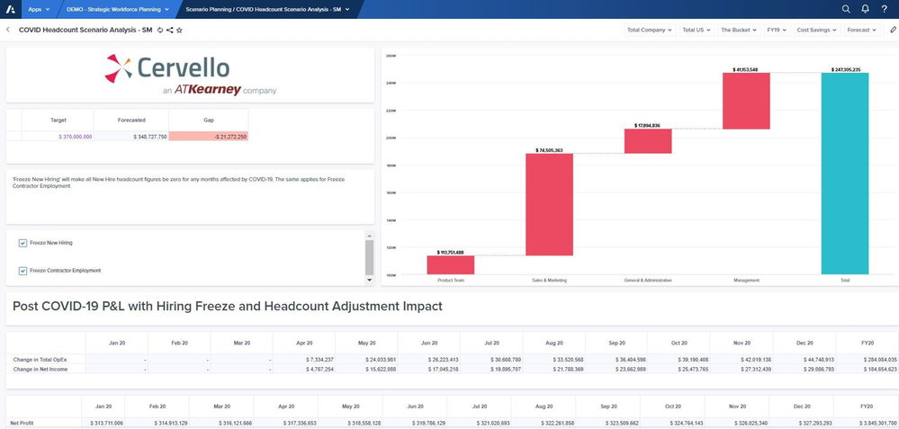
By @AzeemArif, Certified Master Anaplanner.
“This page evaluated the potential impacts of the pandemic considering hiring freezes and headcount adjustments. We developed this demo Page in order to make more informed business decisions. We knew that our company's workforce planning could change on a day-to-day basis. Therefore, we needed a model that could help us make the most informed strategic workforce decisions. This screenshot helps project what impact various hiring freezes will have.”
Get Started:
Use a Waterfall Chart to show how each subset of a list compares to the whole at a glance. Help your users make a detailed assessment by giving them an array of Context Selectors to hone-in on their target.
Incentive Compensation Management
By @brian_gallagher, Certified Master Anaplanner.
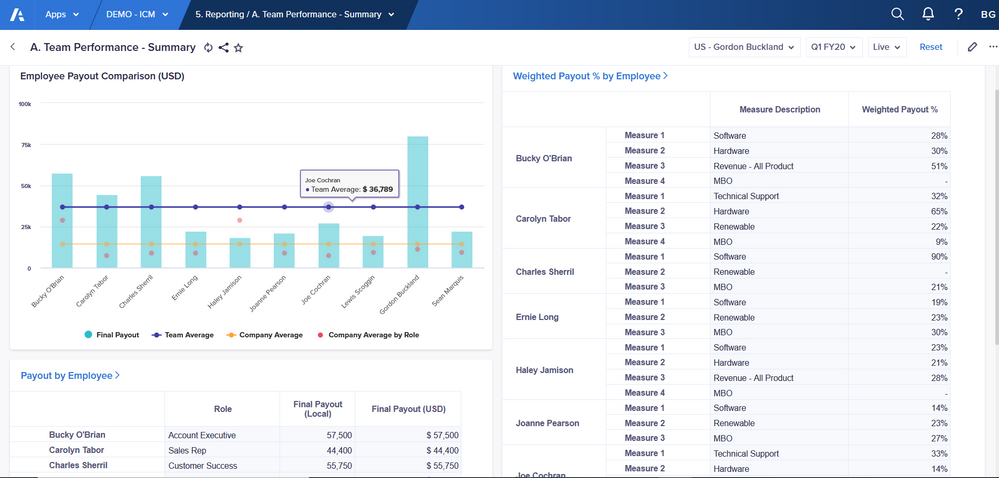
“Above is a page that is part of Cervello's incentive compensation management App my team and I developed this board in order to provide insights to sales managers on how their reps are performing. A few of the cards allow drill-through to detailed worksheets which we've identified as a best practice when designing the experience.”
Get Started:
A Board with good visuals is a great invitation to learn more about the data, and Worksheets enable you to see all the data at once. Link from a Card directly to a Worksheet with related data to create an intuitive experience (read more below).
Here are some details from Certified Master Anaplanner @Brett.Francis about how the drill-through process works:
“An effective method to drive positive user experience is to create summary cards that contain high-level information and allow users to drill through into detailed information by leveraging shortcuts to worksheets. This allows us to keep pages visually appealing, providing quick and meaningful insights at a glance, while allowing for detailed level planning on worksheets.
Drill through navigation from summary cards to detailed worksheets provides users streamlined navigation from reported values to detail level calculations. Without drill through navigation, users would have to search for the worksheet related to the summary card.
In the above example we display a summary card with final payouts by employee, which is a high level report summarizing the group’s performance, and users are able to click “Payout by Employee” (card’s title) to open up the worksheet containing all the steps related to the payout calculation. The navigation back to the summary card is intuitive with an arrow button in the top left that returns users to the previous page."
Sales Rep Performance


By @cduvoisin, Certified Master Anaplanner.
“The team and I developed this App in order to provide insights to Sales Reps on their performance. The board shows a high-level summary/overview of the incentive compensation management process with pertinent information for sales reps. Two linked worksheets further break down the calculations for more insights. For example, if a sales rep wished to see which exact deals they’re being credited on, they could click the “Weighted Payout” card title (“Navigation Link”) and see a breakdown of their deals for a given period. They can also select various filter combinations to view deals by Period, Customer, Product Family, Product, and Compensation Measure.”
Get Started:
Using Boards and Worksheets together (and taking advantage of all of their features!) makes for a fully customizable experience.
Diversity Target Settings
By @kalbelo, Certified Master Anaplanner.
"The Diversity Target Settings page allows us to analyze the current employee makeup of our company. With this page, we can evaluate various regions, compare our actual employee makeup with our Target Goals, and track our company's progress over time."
Get Started:
To get a visual breakdown of a group, use stacked Column Charts and Area Charts. Having a Grid Card nearby makes it easy to compare the numbers.
Sales Performance Management

By @maxberail, Certified Master Anaplanner.
 “Please find above one of the first Page I built during the last Hackathon which occurred during CPX Paris on 16th October 2019.
I worked for the international client LafargeHolcim on a Sales Performance Management (SPM) topic in less than 6 hours. I built this board which allows the Regional Sales Manager to define objectives to his sales team locally depending on a list of KPIs and to adjust the KPIs’ thresholds. And finally after a first pitch in front of the client & Anaplan France team and a second one in front of all the CPX Paris visitors, we won the trophy with my colleague against Deloitte France 😊”
Get Started:
While this Page is from the UX’s beginnings, it boasts some of the key features that make up the core of the experience today.
Product Group Split Forecast

By @FabianC, Certified Master Anaplanner.
“The Board solves a problem the customer had for a long time. To split their forecast down to Product group, own/external brand, country and company. Also to be able to work with changes rather than update every single month, which is solved by the roll forward boolean. When the product group share of sales is updated for one product group the rest is recalculated so that sales always is 100%.”
Get Started:
Sometimes, you just need to compare numbers in a grid. Use this structured approach to a Board if you want to combine rows of information and settings in one view.
We hope you have found some inspiration and are so grateful to the MAs who have participated so far. Bookmark this page – we’ll keep adding as new submissions come in. Last updated November 11th, 2020.
Comments
-
Great detail and good starting point! thanks a lot!!
1


