Top three underappreciated features of the UX


Author: Kait Chura, Certified Master Anaplanner and Solution Architect at LiveRamp.
Reflection is a common practice for me when entering a new year. It's important that I find appreciation in both my personal and professional life, so I know what made my year better. Then, I can either build upon good behaviors in the following year or continue leveraging new things I learned. As my professional life is based on Anaplan, a piece of my reflection came from features in the UX that made my workflow better. As a means of giving back to the Anaplan Community, today I share the top three UX features that I either used more or that were new this past year, and really excite me about the Anaplan roadmap. Please, feel free to share your own in the comments! Let’s make us all better at Anaplan this year!
1. The game changer: synchronized scrolling

I call synchronized scrolling my game changer, because I audibly squealed when I saw this in the card drop down. I texted friends about it (I’m not exaggerating)! I quickly went through dashboards and found where I could apply it, and I shared it with everyone on my team. Some people shared my excitement — others didn’t know what I was talking about.
As I told the confused, in short, when multiple modules have similar dimensions but don’t need something like time on all line items, we were previously required to either make **** modules that had time on some line items (even though it wasn’t a true dimension for that line item) or create two modules for two cards — one with time and one without. Then we crossed our fingers that end users could scroll them both to the same spot on their respective modules. On occasion, we created filters to narrow down what was on the board and reduce the chance of that accidental extra scroll on one module. But in general, these weren’t great experiences for end users.
Enter synchronized scrolling.
Now, we can synchronize vertically or horizontally (either both or independently) for up to four modules in four different configurations. Hopefully, Anaplan has more than four on the roadmap, but for now… I can work with four.
2. The reliable: spread across/spread down
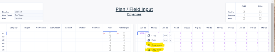
I can’t quite remember when this feature was brought into the UX (I know it was missing in some of the first enhancements and was a fan favorite in Classic), but it's one that I think more people need to be reminded of in 2023. No one wants to copy and paste the same number into multiple cells.
In my experience, teams enjoy being able to start with expenses that are recurring and don’t change (and if they do change in a couple months, they still want the normal amount to be the baseline and then change the outliers). Copy across (or copy down) is a huge time saver and prevents manual errors. Plus, it’s really three clicks.
- Step 1: Enter amount in first period
- Step 2: Right click on cell
- Step 3: Click ‘copy across‘
It’s also great when trying to zero out all the inputs, because changing the first cell to zero then copying across, works beautifully.
3. For the ALM builder: enable multiple source models

For the Dev/ Test/ Prod builders — this should be your best friend when creating new dashboards. Enabling multiple source models allows you to see enhancements in the build state, as your prod model shouldn't be your test model. Yes, Dev models are usually stripped of most data to keep them flat, but you should be able to test changes to formulas in one or two intersections of data, confirm that conditional formatting is triggering, or if test that a filter works before pushing a change into a test model. It can also be temporarily turned on and off when you’re investigating why a card now is saying “You can’t access this card” in the different stages of the build (it could be because we’ve added it in Dev but haven’t pushed to Prod).
Conclusion
These were the three top features that made my life easier in 2022. If you think there were other features I’m forgetting, please feel free to share your thoughts (and additional advice on using these features) in the comments below. Can’t wait to see what 2023 brings us!
Comments
-
Sync scroll was definitely an "Oooo..." moment. Makes life so much easier.
And there's been so much released this year already! But in keeping with underappreciated - my favourite so far it text sizing on boards and text formating.
1 -
The recent addition of being able to format grids on Boards and Worksheets the same as on Report pages is another great recent addition!
1 -
This was a great way to find out about allowing multiple source models on a dashboard - thank you for sharing! I am a big fan of the calculations columns that can be added to table cards within report pages, as it makes variance analysis easy and removes the need to do the calculations in your model.
1 -
Hi,
I am waiting for the sync filter, is it possible? It would also make my life much easier.
1 -
Great callout on the features! I loved the synchronized scrolling too. Makes thing look so much cleaner.
0