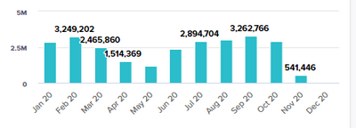
Issue: Data Labels missing in New UX Charts
I am currently facing an issue on some of our implementations on the New UX where data labels are missing in the charts when the numbers are close to each other.
While it is just a minor visualization issue, I've received feedback from some of the clients that they hope this is something that could be addressed.
Other than enlarging the card to an unaesthetic size, is there any other known workarounds or if this something that can be fixed?


Thanks for anyone's time & help!
Answers
-
Have you reported this to support yet as I am betting you are not the only one with this issue.
Rob
0 -
I've recently submitted a support ticket and will post the reply here once i've got it!
0 -
Same trouble...any news on an update?
 0
0 -
Any update on this ? For me some of the data labels are still missing...
0


