Best Of
Create export template for Anaplan users to import using months
Author: Tyler Beck is a Certified Master Anaplanner at TBLB LLC, and is currently a Team Lead at CVS Health.
Use case
An end user needs to export a template from Anaplan using Months as the time period in columns, and qualitative data in rows. When the template is exported as a CSV file the years in the dates turn to days instead of years in the Excel file. The import will result in error when mapping back to native time in Anaplan due to the date change.
Use case example
The module below is exported from Anaplan as a CSV file:
The CSV file is opened and the dates show the years as days, and the years are recognized as the current year DATE() in Excel as a default setting:
The dates in the CSV file will show a format of MM-DD-YYYY instead of the Anaplan format of MMM-YY. This is a major issue for clients who need to export a template to lookup the most recent data when manually inputting data is not feasible due to large data sets. When the CSV file is loaded back into Anaplan, the module will import the data into the wrong months or result in an error all together:
The import shows the error for “Invalid date or timescale identifier” because the expected native time years are shown as days in the CVS file.
Solution
Create a “Dynamic Time” production list in Anaplan apply it to the columns in a new export module as a template. Then import the template back into the input module’s native time using the custom fixed position pattern in the import configuration.
Solution example
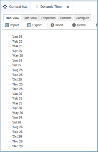
- Create “Dynamic Time” as a production list so the dates can be changed in the Production environment: The list should include a special character in front of the MMM-YY month format that Anaplan uses for native time. The list in this example will use an apostrophe as the special character, and two years are applied to the list. More than two years can be applied to the list, and subsets can be made for forecast and plan months as well.
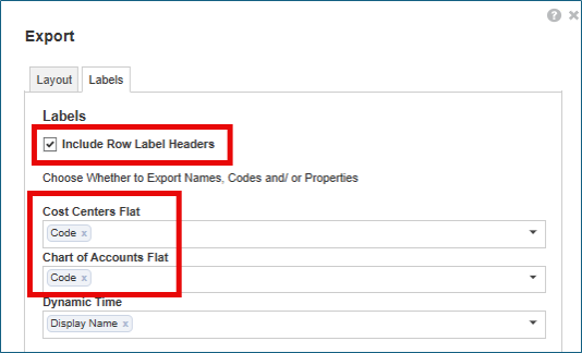
- Apply Dynamic Time list to module and export the template for users to update values: The export template should have all mapping qualitative data fields in rows and Dynamic Time in columns, and include empty rows so end users can create lookups for the data: Also, remember to include the labels and update the “Name” to “Code” for the dimension in the rows: Using codes will not only make using lookups easier in Excel, but is also more efficient for loading back into Anaplan by mapping codes to the dimensions. Placing a special character in front of the native time period format will prevent the CSV file from defaulting to Excel’s MM-DD-YYYY format and now can be mapped to Anaplan’s native time.
- Create an import for the template using a custom fixed position pattern:
Map the codes to the correct dimensions, time as column headers, and the amount as a fixed line item.
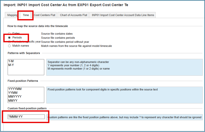
Next, select the Time tab in the import configuration and select Periods for the timescale, then navigate to the custom fixed position pattern section and enter ?MMM-YY. Placing a “?” in front of the MMM-YY format will tell Anaplan to ignore the special character so the format will map back to native time. - Run Import with new configuration to import the template into native time: The import is now successful, importing all fields with no errors. All values have been mapped to the correct dimensions in the correct native time period.
Conclusion
Creating an export template using a production flat list can allow end users to export a template to populate data to import back into Anaplan by placing a special character in front of the month names. This will allow end users to bulk upload large data sets when manually inputting the values is time consuming and tedious. Remember to always export the template to include all rows and to show labels, as well as changing the “Name” in the label to “Code” so numbered lists can be mapped seamlessly.
 tbeck
tbeck
Re: Recognizing your impact: new points, badges, and ranks!
Great questions @SanthoshS! You're correct, the points do not reset annually; they accumulate throughout your entire Community journey.
Regarding your concern about it becoming too easy, we've designed the rank system to focus on how points are earned, not just that they are accumulated. When creating the updated ranks, we carefully looked at the distribution of our members and points. Our goal is to see our dedicated members reach the highest ranks, including Legend! You can learn more about points and how to climb the ranks in this article:
The activities that help you progress in the beginning are focused on initial engagement and getting familiar with the Community. As you climb the ranks, the emphasis shifts to more high-impact contributions, such as becoming a go-to resource for complex forum questions or sharing your deep expertise with other members.
While we would love to see our dedicated members reach the Legend rank, the path is designed to ensure it's a title that is truly earned and one you can be proud of!
Add XOR formula
Title says it all, a XOR formula would be really helpful and reduce formula length when trying to test an exclusive or.
For those unfamiliar, here is the logic table for XOR. It acts as an OR however if both inputs are TRUE, then XOR returns false.

Re: True ALM for Anaplan Data Orchestrator
In addition to this. An issue we're currently facing is we periodically replace DEV models with PROD (to get all the lastest input data), but when we do this, the links are no longer functional (pointing to the archived version). A proper ALM solution should allow us to point to a new environment/model easily without needing for the original model to still be online please.
Recognizing your impact: new points, badges, and ranks!
Inspired by the incredible engagement and collaboration we see in our Community every day, we want to better celebrate your contributions. We’re thrilled to introduce our updated Community ranks to clearly map out your engagement journey with us!
Recognizing your Community contributions
We've updated our Community ranks to better celebrate and recognize everything you've already contributed.
To ensure your new rank accurately reflects your impact, we've been tallying points for your helpful activities behind the scenes. Starting today, these points and your updated rank are visible on your Community profile. Consider it a thank you and a head start for the incredible value you bring to our Community!
Showcase your expertise with points and badges
You are the heart of our Community, and our updated ranks are designed to show it. As you share knowledge and help other members, the points and badges you earn will grow your rank and showcase your expertise.
Watch your points grow
Earning points is straightforward — you'll be rewarded for the activities that help our community thrive. You can earn points by:
- Answering questions in our discussion forums.
- Having your answer to a question marked as accepted.
- Receiving reactions to any of the posts you have authored.
- Unlocking milestone and contribution badges, which come with bonus points.
A quick note: while reacting to others' content is a great way to show appreciation, points are awarded for receiving reactions on your own insightful posts, not for giving them.
Unlock badges for your profile
Badges are special honors displayed on your profile that showcase your unique achievements and Community milestones. Many also grant you a bonus set of points!
Badges are awarded for a wide range of accomplishments, including:
- Community milestones: reaching specific counts for your answers, comments, and received reactions.
- Anniversaries: celebrating another year as a valued member of the Community.
- Event attendance: joining us for virtual Community events.
- Community Challenges: contributing your perspective to Community prompts and learning from others.
To learn all the details of how to earn points and badges, check out our guide here!
Level up with our new ranks
We're renaming our ranks to make your progression clearer and more meaningful. Your rank, which is displayed on your profile next to your Community name, is a direct reflection of your impact on the Community.
We are excited to unveil our new Community ranks below!
We want your progression through the new Community ranks to be clear and rewarding. The points system is designed to be a direct reflection of your contributions.
As you continue to share your expertise — by answering questions, earning badges, or having your posts recognized by others — you will accumulate points. These points create a clear path for your growth, advancing you to the next rank as you go.
Here’s how your points will translate to each new rank:
Rank | Points earned |
|---|---|
New Member | Getting started — ready to earn points! |
Explorer | 0-4 points |
Contributor | 5-19 points |
Pioneer | 20-29 points |
Guide | 30-59 points |
Advisor | 60-149 points |
Innovator | 150-499 points |
Legend | 500+ points |
Ready to climb the ranks?
To learn all the details about our updated ranks and see exactly how you can earn points and badges, check out our complete guide in this article.
Thank you for being an incredible member in the Anaplan Community! We've launched these new ranks to recognize your journey, and we're excited to see you climb them as you keep learning, sharing, and connecting!
Re: Share your annual rollover best practices — Community Q&A Challenge
Some of my key learnings over the years regarding rollover have been:
1.First and most important activity - Copy & Archive the model to have as a backup in case things go wrong.
2.Do a test run in a dummy model if feasible to spot any issues you'd face early on.
3.Maintain a separate time settings / lookup module with all time related settings. Easier to handle things in a few modules than trying to find out what breaks where.
4.Clean up time ranges not required - Have proper naming, spot the ones that overlap and keep only 1 of them. The lesser the items to maintain, the easier the activity.
5.No hardcoding of formulas, a simple annual activity would leave you wondering why a working system suddenly broke because some formula contained time.'FY 23' instead of a PY line item reference :)
6.Update opening balances, where required, especially in case of balance sheet/inventory/cash flow forecast etc since your last opening balance might be from the year before that could be lost in the rollover activity.
7.DO NOT rely on the brought forward option unless it's been turned on since the inception of the module. It comes with it's set of nuisances that we found out the hard way but your pages break/time hierarchy filter breaks on the front end and so do filters. Easier solution is to just have a separate module with the opening balances stored.
8.Check your key figures before and after the rollover activity to ensure everything is still working fine. A simple export/snapshot of the report can help you compare the before and after.
9.If you work with custom time for reporting, ensure the new periods are added to that list and the relevant mappings have been updated.
10.Last but not the least, document the steps you did for the model so the next time it is a simple checklist activity instead of "Where do I start" activity :)
Excited to read & learn more from others on how they handle their annual rollovers!
Optimization - Line Items References in saved view
To maintain efficiency and performance, model builders must periodically remove unused or irrelevant line items. At present, the [Referenced By] column in the blueprint provides visibility into dependencies between line items. However, for line items that are not referenced by other calculations, builders must manually review each Saved View within a module to determine whether those line items are in use. This process is time‑consuming and prone to oversight.
To address this challenge, I propose the introduction of an [In Saved View] column within the blueprint. This feature would allow model builders to quickly identify whether a line item is included in any Saved View, thereby streamlining the cleanup process. Such functionality would:
- Enhance efficiency by eliminating the need for manual inspection of Saved Views.
- Improve model hygiene by enabling the removal of unused line items with confidence.
- Support long‑term sustainability by making ongoing maintenance more straightforward.
- Contribute to overall model stability and performance.
By providing this additional layer of transparency, Anaplan would empower model builders to manage their models more effectively and ensure that they remain optimized as they grow and adapt to client demands.
Introducing New Resources for Anaplan Polaris: Benchmarking Performance
I'm very excited to share two new comprehensive technical resources that showcase the exceptional performance capabilities of Anaplan’s Polaris calculation engine. These documents provide detailed benchmarks and real-world performance metrics that demonstrate how Polaris delivers the scale, speed, and interactivity required for modern enterprise planning.
Anaplan has invested an enormous amount of time and effort in building the proprietary Polaris engine to be the most performant and scalable interactive general-purpose multi-dimensional planning tool. These documents show in quantified terms against real-world scenarios what has been achieved.
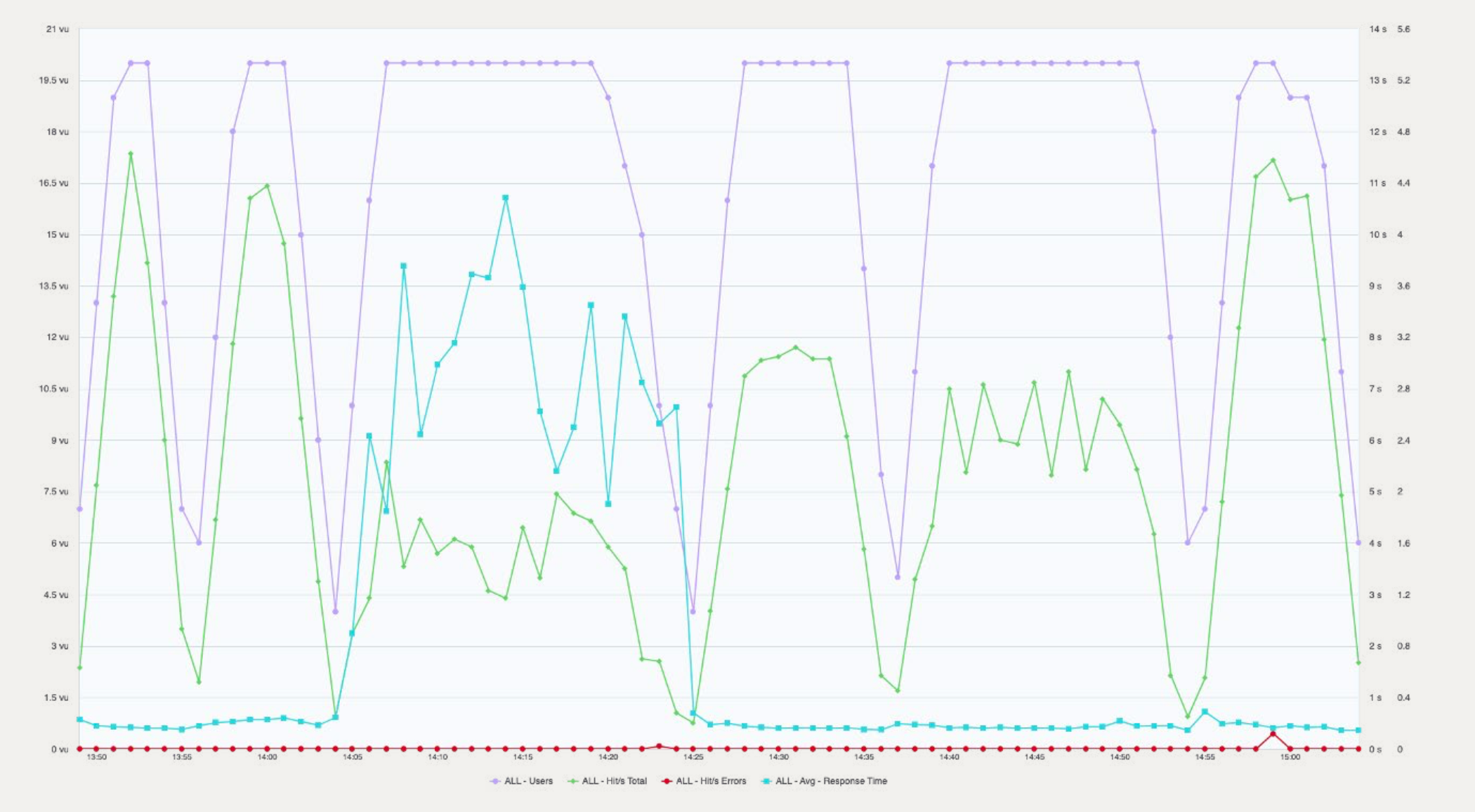
Chart showing Average Response Time and other Statistics for a 20 user concurrency test of 6 User Journeys comprising 80 Interactive Steps on the Demand and Inventory Planning Supply Chain Application running on Anaplan Polaris.
Polaris Scalability: Powering Multi-Dimensional Planning
The first resource, Anaplan Polaris: Powering high-dimensional calculations and sub-second interactivity at enterprise scale reveals the raw technical capabilities of the Polaris engine. The benchmarks are impressive:
- Quintillions of addressable cells per line item, enabling organizations to model at their natural business dimensionality
- 30+ billion populated cell capacity in a single model (we've seen production models with 17+ billion cells)
- Millisecond-level recalculations – even single-cell changes in trillion-cell models complete in just 3 milliseconds
- 2.5 million aggregation operations across deep hierarchies completed in under 14 seconds
These metrics show the scale and raw power of the Polaris calculation engine in technical terms. However, to truly understand the relevance of these metrics we need to understand how Polaris can be used in a business context – and to demonstrate that we have also benchmarked the Polaris powered Demand and Inventory Applications for Supply Chain.
Supply Chain Planning: Performance in Action
The second resource, Anaplan Polaris: Enterprise-grade speed for supply chain demand and inventory planning demonstrates these capabilities in a real-world context. Using a representative dataset from a large consumer goods company (20,000+ SKUs, 300+ customers, 250+ locations), we tested six common supply chain planning user journeys with 20 concurrent users.
The results speak for themselves:
- 90% of user interactions completed in under 1 second
- 1 minute 33 seconds total processing time for all six user journeys
- 1.16 seconds average response time for the median user interaction
This level of performance transforms how planners work, eliminating the frustration of waiting for calculations and enabling truly interactive, collaborative planning sessions.
Why This Matters
These benchmark documents demonstrate that enterprises no longer need to choose between Interactivity, scale, and speed. With Polaris, you can model your business at its full complexity while maintaining the sub-second responsiveness that keeps planners engaged and productive. Whether you're doing financial planning across across thousands of entities or optimizing inventory across a global supply chain, Anaplan Polaris delivers the performance you need.
Allow non-WSAs to view source module name in UX.
When a user clicks the ellipsis in a grid card they should be able to see the name of the source module.
This empowers end users with the ability to connect to the source data they see in the UX to the module in the backend. It also enables end users to pull the data into Google Sheets or Excel.
 RyanD
RyanD
Search Icon missing in the beta version of new module inventory
Hello Everyone,
I see that in the beta version of new module inventory, there are two issues:
1) The Search icon is missing, which is there in the earlier version.
2) When we use the find option (Ctrl +F), it only searches the module names present in the current screen and not from the entire list of modules.
Attached the pic for the same. I hope Anaplan support takes note of this and resolve this issue soon.
Thanks,
Praveen


