Best Of
A CoE becomes essential when you own Anaplan
A CoE becomes essential when you own Anaplan
Author: Stacey Borne is a Certified Master Anaplanner, former Anaplan Center of Excellence Leader, and runs the Certified Master Anaplanner Program and Anaplan Center of Excellence Programs at Anaplan.
You don’t need a large team to have a Center of Excellence, but you do need ownership.
One of the most common Center of Excellence related hesitations I hear from customers early in their Anaplan journey sounds something like this:
"We like the idea of a Center of Excellence, but we’re not big enough yet."
"We don’t have the capacity for a dedicated team."
"We’re still learning the platform, we’re not ready for that."
These are reasonable concerns. But they reflect a broader assumption that a Center of Excellence is something that comes later, once scale, maturity, and resourcing justify its existence.
In practice, the opposite is true.
An Anaplan Center of Excellence is not defined by team size or organizational structure. It is defined by ownership. And whether that ownership is formalized or not, the responsibilities associated with managing an enterprise platform like Anaplan are present from the moment of investment in the platform.
The question is not whether those responsibilities exist. It is whether those responsibilities are intentionally managed.
The cost of delayed ownership
In working with organizations at this stage, the pattern is consistent. Smaller teams and limited capacity are not inherently problematic. What does introduce meaningful risk is a lack of clear ownership, particularly when paired with incomplete training.
When ownership responsibilities are undefined, there is no consistent accountability for how the platform is managed, how changes are introduced, tested, and migrated to Production, or how users are supported. Layer in training gaps, including model builders who have not yet completed critically important foundational training such as Level 1, and the risk compounds quickly.
What often begins as incomplete training doesn’t remain isolated to initial onboarding. It evolves into a broader gap in operational capability, essentially a lack of understanding of how to manage the platform in a day-to-day environment. How changes should be governed. How models should be maintained. How the platform should be positioned and reinforced across the business.
As a result, changes are made by model builders who haven't learned the platform and recommended best practices yet, and are migrated to Production without the appropriate level of validation, introducing risk to downstream processes and de-optimization of the models. Over time, this creates a disconnect between the investment made and the value realized. Trust in the platform begins to degrade as users question the reliability of outputs. When trust erodes, adoption follows. The organization may have invested significantly in the platform, but lacks the internal capability to operate it effectively, scale it confidently, or fully rely on the decisions it informs.
Without clear ownership, these gaps and risks are not contained; they persist, expand, and become increasingly difficult to correct. This is exactly why a Center of Excellence exists: to establish this ownership, reduce these risks, and ensure the platform delivers the value it was designed to provide.
Adoption and trust are not byproducts; they are outcomes of intentional management
There is a tendency to view adoption as something that follows naturally from implementation. In reality, adoption is the result of deliberate, sustained effort.
It requires clarity around how the platform fits into core business processes, consistency in how it is used across teams, and reinforcement from those responsible for its operation. It also requires confidence, not just in the functionality of the platform, but in the integrity of the outputs it produces.
That confidence is built through disciplined management, consistent release practices that prevent avoidable disruption, clear communication that helps users understand not only how to use the platform, but why it should be trusted, and through ongoing investment in capability building, ensuring that both builders and end users are equipped to engage with it effectively.
Absent that structure, adoption does not stall, it regresses.
And when that happens, the organization is left in a position where the investment in the platform is not fully realized, not because the value is not there, but because it is not being managed and captured. This is why a Center of Excellence exists: to actively drive adoption, build trust in the platform, and ensure its value is fully realized.
A Center of Excellence begins as a set of owned responsibilities
The misconception that a CoE must be a fully formed team is often what delays progress. For many organizations, particularly those with a smaller Anaplan ecosystem, a CoE is not initially an organizational construct. It is a set of responsibilities that are clearly defined and consistently executed by at least one assigned owner responsible for Anaplan platform management.
Those responsibilities span governance, adoption, change management, enablement, and support. They require decisions about how models are maintained, how changes are introduced, how users are trained, and how issues are resolved. They require someone to be accountable for the health and effectiveness of the platform across their organization.
Over time, as the platform scales, these responsibilities may formalize into a dedicated team. But waiting for that structure to emerge before establishing ownership practices over the platform management creates unnecessary risk.
Structure does not enable ownership. Ownership enables structure.
What a CoE can look for a small Anaplan ecosystem
The structure of a Center of Excellence is not fixed. It adapts based on the scale and maturity of the platform within the organization. This is especially true in the early stages of your Anaplan journey or in organizations who have a small Anaplan ecosystem with a limited number of use cases implemented.
There is no single “correct” way to structure a successful CoE. While structures vary, the outcomes remain consistent. In an early-stage or small Anaplan ecosystem with a low number of use cases implemented, a CoE may not be resource-heavy.
- A single leader may own governance, change management, model development practices, and user support
- A dedicated CoE lead may partner with a functional leader, for example Finance, to align platform ownership with business priorities
- A small cross-functional group may share platform ownership responsibilities to ensure multiple perspectives are considered when defining and enforcing governance processes
In these early-stage structures, the individual acting as the CoE leader may not carry the formal title of “Anaplan CoE Leader.”
They may be a:
- Vice President
- Director
- Finance Manager
- FP&A Manager
- Systems Manager
The title does not define the role. Taking the lead on establishing how your organization will own the platform and associated responsibilities does.
Equally important, this role requires a direct line to an executive sponsor and the ability to influence and drive change across the organization. Establishing governance and processes are only part of the equation. Ensuring they are adopted requires influence and strong change management skills, as well as alignment with business leadership.
Regardless of structure, title, or number of use cases, someone must be accountable for how changes are introduced, tested, and migrated to Production, how users are trained and supported, and how trust in the platform is built and maintained.
Owning that accountability and documenting your established processes for managing the platform, combined with the ability to drive adoption and organizational alignment, is what defines a Center of Excellence.
Building discipline early
Organizations that extract meaningful value from Anaplan tend to share a common characteristic: they introduce discipline early in their journey.
They define ownership of the platform, even if that ownership sits with a single individual. They establish clear expectations around how changes are managed and deployed. They create mechanisms for prioritizing work and supporting users. And they treat training not as a one-time activity, but as an ongoing component of how the platform operates.
Governance, in this context, is not about adding complexity. It is about creating consistency. It ensures that decisions are made deliberately, that changes are introduced responsibly, and that users experience a platform that behaves in standardized, predictable, and reliable ways.
This consistency is what ultimately builds trust. And trust is what drives adoption and enables scale.
Adoption and scale follow ownership, not the other way around.
As organizations grow their use of Anaplan, their CoE will naturally evolve. Responsibilities may become more specialized. Processes may become more formal. Teams may expand.
But scale without foundational ownership introduces more variability, more risk, and more inefficiency.
The organizations that scale effectively are not those that waited until their Anaplan ecosystems were “large enough” to establish a CoE. They are the ones that recognized early that platform ownership is not optional and acted accordingly.
The takeaway
You do not need a large team to have a Center of Excellence.
You do need clear ownership.
- Ownership of how the platform is governed.
- Ownership of how changes are introduced, tested, and migrated to Production.
- Ownership of reducing platform risk, through disciplined processes, not reactive fixes.
- Ownership of requirements for capability, including expectations that model builders have completed foundational training before making structural changes.
- Ownership of how users are enabled, supported, and held to consistent ways of working.
- Ownership of how trust is established, reinforced, and maintained over time.
This is the role of a Center of Excellence. Not as a concept or a future-state team, but as the function responsible for ensuring that this ownership exists, is clearly defined, and is consistently executed. This is critical because these are the elements that determine whether a platform delivers sustained business value or falls short of its potential.
Without this level of ownership, organizations don’t just slow down, they introduce unnecessary risk, create inconsistent user experiences, and undermine confidence in the platform itself.
For organizations early in their journey, the question is not whether you are ready for a CoE.
It is whether your platform has the ownership it requires. Whether or not you feel ready, you need a CoE to ensure that ownership exists and drives success.
Check out these additional resources
Want to learn more? Establishing ownership and building a CoE starts with the right foundation. These resources can help:
Join the Anaplan Center of Excellence Program
A customer engagement program designed for CoE leaders and teams to connect, share best practices, and learn how to strengthen governance, adoption, and platform ownership through dedicated content, events, and the CoE newsletter.
A downloadable template to help you define your CoE structure, including governance, processes, roles, and question/issue intake workflows so ownership responsibilities are clearly established from the start.
Role-based learning paths that build the foundational and advanced capabilities required to effectively design, manage, and scale Anaplan, ensuring model builders are properly trained before making structural changes and enabling end users to confidently adopt and trust the platform.
 StaceyB
Re: Guidance Required on Converting Visitor User to Internal User
Each userid is assigned a default tenant, and a "visiting user" is any user whose default tenant is not this tenant. Visiting users cannot get assigned to some roles such as Integration Administrator, nor they interact with the REST APIs.
Typically the user's default tenant is the first tenant that the userid was enabled in, so any @anaplan.com support or PS team member or any consulting partner is very likely to have another tenant as their default. Support can change a user's default tenant. Be aware that if they are re-assigned, they may lose roles or REST API access in their previous default tenant.
Personally, I prefer to get around this by creating unique email aliases for each customer tenant that I work with.
Re: Trying to find a way to flag matches in two line items in the same module.
Hey Drew - check this out
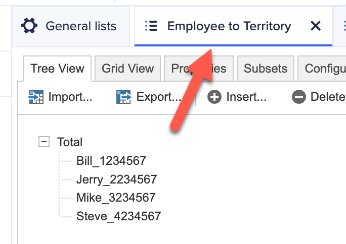
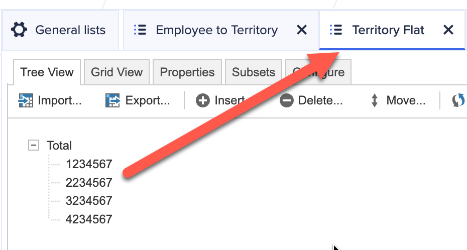
My lists:
Modules
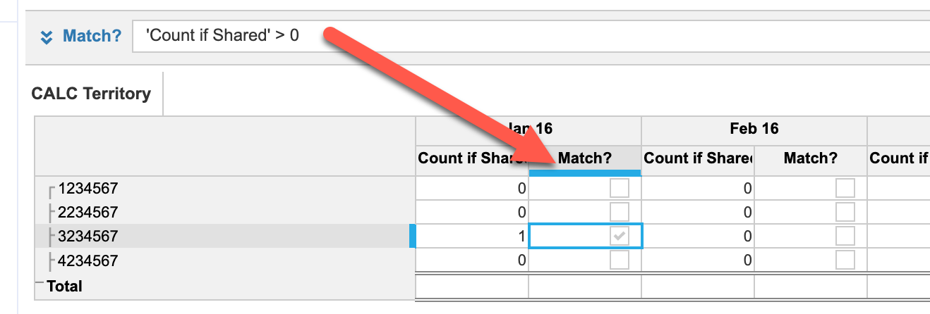
I added a count to your module
Created a new module (CALC Territory) that is dimensionalized by Territory Flat and Time
Back to the original module, for Match?
for a result of
If I add another member in Shared Terriory
Hope this helps
How I Built It: Sensitivity analysis
Author: Casey Pham is a Certified Master Anaplanner and Director of FP&A Systems at Yext.
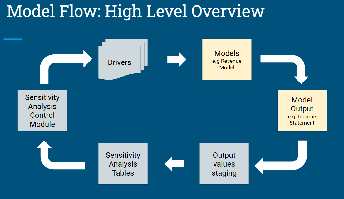
In this ‘How I Built It’ video I'll show how I built a model and process to run a sensitivity analysis. Tens or hundreds of scenarios without overloading the model with too many scenario list items and manually updating driver inputs over and over.
What is a sensitivity analysis?
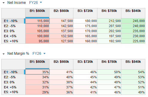
A sensitivity analysis is similar to a what-if analysis to see how changes in one variable affects the outcome in another. It helps to understand risk, identify key drivers, and insulate the impact of different factors. In this simple example, we see how different bookings forecasts (columns) and different expense drivers (rows) will affect net income and net margin after it runs them through a revenue model and P&L statement.
The 'How I Built It' video is below, but first here are the steps I took.
Steps and components
Step 1
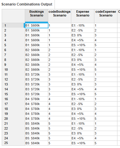
Set up a list for each driver with the number of scenarios you want for each one. The list item code must be numerical and sequential. Create a subset for the active scenario (will explain later on)
.
Add a corresponding module to input the drivers in for each scenario.
Step 2
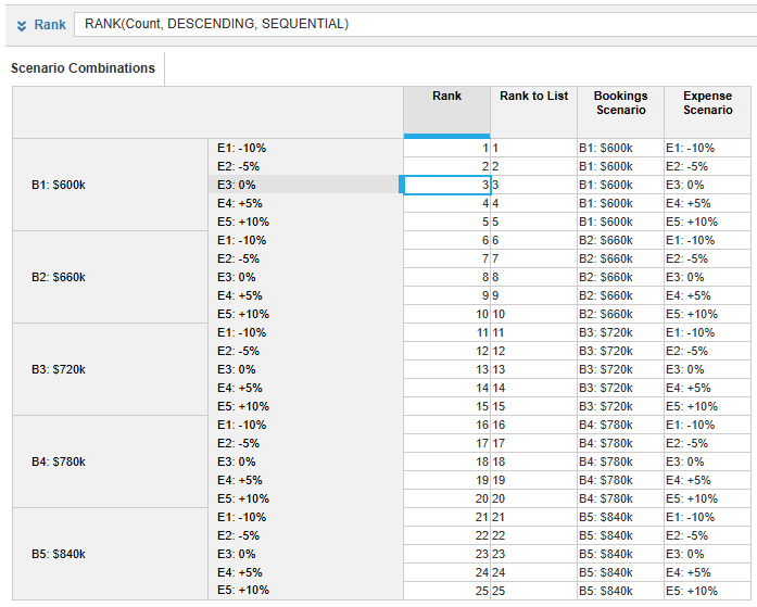
Create an index list, a numerical list. At a minimum it should be the number of scenario combinations you have. e.g. 5 bookings and 5 expense scenarios equals 25 combinations
Create a module that will assign a number to each scenario combination, via rank function, then finditem it to the index list.
Step 3
Create a control module that will be used in the integration process to know which combination of scenarios to calculate.
Step 4
Set up actions and combine them into a process:
- Import scenario drivers into their applicable model.
- In each scenario list, clear the active subset and mark the current active scenario.
- Export the model results into the a staging table that only has the active subset of scenarios.
- Export the results from the staging table to the sensitivity table.
- Increment the scenario number parameter to the next one.
Repeat from step 1 as many times as the number of scenario combinations you have. Alternatively, use Anaplan Connect and a script that you can set the number of times to repeat the same process.
'How I Built It' video
Questions? Leave a comment!
……………
 cpham
cpham
Re: I am working on Level 3 V1 section 6.3, I would like to know if the Example is what given is right
Hi,
The example is right.
Re: Activity: Import Data of Employee details
Hi @sandeepreddy0021 ,
I may not be fully understanding your question. When the target items are highlighted in blue, as in your example, it indicates that they are available for mapping. Are you saying that when attempting to map the source items to the target items, the mapping is not being applied correctly?
Best,
Dumitrita
 MoraruD
Re: Workflow Template Groupings
That’s a thoughtful suggestion—grouping workflow templates by admin would make it much easier to filter and focus on those tied to high‑level processes. It would give structure to the template library, reduce clutter, and help teams quickly find the workflows relevant to overarching goals rather than sifting through everything individually.
Re: How I Built It: Number format converter (thousands and millions)
Unfortunately, I don't think this is available to be toggled by user.
Unless there's a way I am not aware of?


