Best Of
Color Code the different workspace environments for Anaplan
In as much detail as possible, describe the problem or experience related to your idea. Please provide the context of what you were trying to do and include specific examples or workarounds:
As a Product Owner, I spend a lot of time in our different workspace environments updating various configurations, entering data, etc. It would be great if each workspace environment was color coded so I could easily identify which environment I am currently in. Any colors would work, putting an example below.
Dev = Green
QA - Yellow
Prod = Red
How often is this impacting your users?
Daily for our MBs, testers and Admins.
Who is this impacting? MBs, Testers, Product Owner, Admins
What would your ideal solution be? How would it add value to your current experience?
Here is how SAP uses it….
SAP: Built‑in, widely used color coding
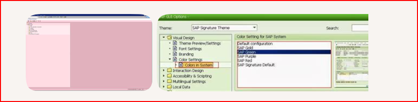
SAP GUI has native color‑coding for environments, and it’s extremely common for teams to use it to avoid mistakes (like posting data in PROD by accident).
How SAP color coding works
SAP GUI lets each system (DEV, QA, PROD, etc.) be assigned a distinct color theme. This is configured in:
SAP GUI → Options → Visual Design → Colors in System
You can choose from predefined themes (e.g., Grass, Lunar Orbit, Rose) or set custom colors.
What it typically looks like
Organizations often follow a traffic‑light pattern:
- DEV → Green (safe to experiment)
- QA → Yellow/Gold (caution, testing)
- PROD → Red/Rose (danger, real data)
The color appears in the SAP GUI window frame and background elements, making it immediately obvious which environment you're in.
Please include any images to help illustrate your experience.
How do people currently manage their different environments? Any ideas?

YTD Should Exclude Current Month and Include Actuals Only
Currently, Anaplan’s native YTD (Year-to-Date) calculation includes the Current Period, even when that period contains forecast values.
Issue
From a financial planning and FP&A perspective, YTD is expected to represent Actuals only. However, Anaplan calculates YTD including the Current Month, which can contain forecast data.
This results in YTD values mixing Actuals and Forecast, which is not aligned with standard financial reporting practices.
Example
If the Current Period is May:
- Expected YTD:
Jan–Apr (Actuals only) - Actual YTD in Anaplan:
Jan–May (includes current month values)
Impact
- Incorrect YTD reporting
- Misalignment with standard FP&A definitions
- Confusion for business users
- Requires custom workaround in every model
Current Workaround
Custom YTD logic is required to exclude the current period, for example:
IF ITEM(Time) < PERIOD(CURRENTPERIODSTART()) THEN <Value Line Item> ELSE 0
(or similar time-based filtering to exclude the current month)
This ensures only completed periods are included but requires additional build effort and ongoing maintenance.
While effective, this approach:
- Requires additional line items and logic
- Must be replicated across multiple modules
- Adds unnecessary build and maintenance overhead
Enhancement Request
Provide a native option to support standard financial behavior, such as:
- YTD (Actuals Only)
- OR a configurable setting to:
- Exclude the Current Period from YTD calculations
- Restrict YTD to completed periods only
Why This Matters
Aligning YTD functionality with Actuals-only logic will:
- Improve reporting accuracy
- Reduce model complexity
- Eliminate repetitive custom logic
- Increase user trust in Anaplan outputs
- Better align Anaplan with real-world financial practices.
Call to Action
If you have encountered this limitation, please upvote and comment to help prioritize this enhancement with the Anaplan Product team.
 Mahi0921
Format Column for List Formatted Line Item in Module Blueprint Export
When we export module blueprint to a file, list formatted line item has the list ID as value in the Format column instead of the name of the list itself. It will be useful if the list name is also added so that the exact list used by a specific line item can be known more easily without referring back to Anaplan blueprint.

Allow workflow schedules to be set to run on certain business days of the month
In as much detail as possible, describe the problem or experience related to your idea. Please provide the context of what you were trying to do and include specific examples or workarounds:
When we create a workflow, we really need the schedule to occur on certain days to align with the planning calendar (business days 7-15 for example). For all other business days, we do not want new data imported because we need the data to be static/stable. Currently we are not able to handle this cadence in Workflow, so we must rely on
How often is this impacting your users?
It requires us to be dependent on the upstream ETL team to ensure the file is sent to Anaplan on only the business days needed and to allow for flexibility if the process needs to change. To have control of this in Anaplan's Workflow functionality would give our business admins high confidence that we are only loading data when we need to, and the ETL team would be able to drop a file every day (much more simple), knowing it only gets picked up in Anaplan when we need it
Who is this impacting? (ex. model builders, solution architects, partners, admins, integration experts, business/end users, executive-level business users)
admins, integrations experts
What would your ideal solution be? How would it add value to your current experience?
In the Repeats area, add a radio button to select Business Days of the month to allow people to select the business days. May also need to allow a client to define which days the company considers a holiday
Please include any images to help illustrate your experience.
 clarissa
Ability to Wrap Text in Action Cards
Need an ability to Wrap Text (Have Multiple lines option) in Action cards because the name of the action drives the size of the button horizontally.
With this idea we can control the size of the button as well as the dashboard real estate.
 Misbah
How I Built It: Supply Chain Transport Optimizer in Anaplan

Author: Author: Soumya Bhattacharya is a Certified Master Anaplanner and Advisory Manager at Accenture.
In this ‘How I Built It', I’ll show how Anaplan’s Optimizer can be used to demonstrate effective transportation and supply planning across a network of suppliers and distribution centers.
By leveraging Anaplan’s modeling flexibility, you can simulate complex real-world supply chain conditions — such as multiple suppliers, varying lead times, transportation costs, and capacity or demand constraints — all within a single connected model.
This Transport Optimizer project showcases how Anaplan can reduce total lead time, balance supplier capacity with customer demand, through mathematical optimization. The result is a dynamic and responsive plan that helps supply chain teams make faster, data-driven decisions when disruptions or demand fluctuations occur.
Users can easily evaluate the impact of changes in supplier capacity, or delivery lead times, ensuring that supply plans remain feasible and cost-effective even under uncertainty.
Key advantages
- Holistic supply chain visibility: Integrates suppliers, transportation lanes, and distribution centers into one model, enabling end-to-end optimization.
- Optimized transport planning: Minimizes total lead time and logistics cost while respecting supplier capacity and customer demand.
- Scenario modeling and flexibility: Run “what-if” scenarios (e.g., a supplier shutdown, capacity changes, or new distribution center) to assess network impact instantly.
- Dynamic response to disruptions: Adjust plans in real time when lead times, demand, or capacity shift, without rebuilding the entire model.
- Reduced manual effort and faster decision-making: Automates allocation and routing decisions that would otherwise require complex spreadsheets or manual planning.
- Customizable to business needs: Configure weighting factors (lead time vs. cost) or add extra constraints (e.g., service level targets, emission limits, or transport mode restrictions) to align with business priorities.
Questions? Leave a comment!

Management Reporting Tips and Tricks
Ryan Whalen shares his tips and tricks to creating a stunning and dynamic Management Report page.

Polaris Building and Debugging Tactics
Author: Dana Evernden is a Principal Solution Architect at Anaplan, pioneering the Anaplan Delivery Assurance Program.
Polaris Building and Debugging Tactics
Tired of sluggish models and performance bottlenecks in Polaris? Ever feel like you're just one tweak away from unlocking lightning-fast speed? You've found the link you've always needed. This is your definitive guide to transforming your models from frustratingly slow to incredibly responsive.
A quick tip for build teams: The most successful, nontroubled projects treat performance tuning as a key part of the process. It’s a small investment that pays huge dividends in the end-user experience, resulting in customer trust that translates to continued implementation phases. Dive into these essential tactics and learn how to build, tune, and debug like a pro, ensuring your end-users get the seamless experience they deserve.
How to Use This Guide
- Establish the Foundation: Start with the Key Reminders, When to Use This Guide, and the Performance Checklist. These sections ensure you are applying Polaris best practices at the correct stages of the build lifecycle and within the appropriate model components.
- Prioritize Impact: When evaluating model performance, follow the Steps for Prioritizing Optimization Opportunities. This section helps you focus on the most impactful metrics first, ensuring your tuning efforts yield the greatest performance gains.
- Implement Solutions: Consult the Optimization and Debugging Tips for a deep dive into proven methods for refining formulas, reducing engine effort, and resolving common bottlenecks.

Key Reminders for Building in Polaris
When building in Polaris, keep these foundational principles in mind:
- Use ALM from the start: Review this Iterative Development in Polaris community article to properly set up your environments.
- Monitor metrics closely: Tread carefully and check Calculation Effort, Memory, and Populated Cell Count frequently when building in large, highly dimensionalized modules (e.g., output, reporting, or input modules).
- Test piecemeal: Refer to the iterative development article to ensure you are testing complex modules in stages.
- Stay sensitive to complexity: As model complexity increases, the risk of performance issues grows. Regularly check the performance metrics listed below.
When to Use This Guide
- Actions are running slowly.
- Model open time is latent.
- Cell data entry feels sluggish.
- Routine performance health checks.
Performance Review Checklist
Periodically review these areas to ensure optimal speed:
- Integrations: Monitor regularly scheduled data flows, both automated and manual.
- Processes: Audit long-running processes.
- UX Rendering: Check the speed of Boards, Pages, and input views.
- Model Open Time: Review the calculation effort within the first 10 minutes of the model opening.
If performance degrades, export the Line Items tab to pinpoint and optimize formulas. It is critical to test the model at scale by frequently pushing to a fully loaded Test model to test the most used features of the model.
Refresher: Review the Anaplan Polaris – Calculation Effort article for more on identifying top-effort line items.
............................................................................................................................………………………………..
Steps for Prioritizing Optimization Opportunities:
- High Calculation Effort + High Complexity + High GB: Focus here first. These line items offer the most room for improvement and impact cumulative performance (similar to Best Practices in Classic). Note that an inefficient calculation can have high calc effort even if it results in an unpopulated cell. Review the 'Calculation Effort’ section on Slide 17 onwards in this Community article presentation: Anaplan Polaris: A deeper dive into the Polaris Engine and model building techniques. It’s important to note that an inefficient calculation can have calc effort but still result in not populating a cell.
- High Calculation Effort + Computationally Intensive Functions: Address line items with high Calculation Effort that use functions like FINDITEM, ISFIRSTOCCURRENCE, RANK, RANKCUMULATE, and CUMULATE (performance can be dependent on data).
- Summary Methods: Review use of summary methods at very high cell counts. Can these be made end-of-chain to enable On-Demand Calculation (ODC)? Are all summary levels of the hierarchy needed?
- High Complexity + High Cell Count: Even if they have a small Populated Cell Count and Calculation Effort, they have the potential to cause performance issues if the addressable Cell Count and Complexity is high.
- ‘All Cells’ Complexity: Finally, focus on line items with Calculation Complexities that equal ‘All Cells’ in line items with high cell counts as they may pose a risk due to their inherent fully dense nature.
A note on GB: GB is the size equivalent of the populated cells, and while it doesn't factor into performance directly it could validate the high complexity or calculation effort values. Very high GB would mean high populated cells which could be caused by high complexity. If complexity is low, high Populated Cells/Memory Use could be an indicator of a line item which might by optimized by making it end of chain so it can take advantage of ODC.
............................................................................................................................………………………………..
Optimization and Debugging
Optimization and debugging are a necessary step in any build timeline. Try these strategies below for ways to debug and optimize formulas as needed.
Disclaimer - Anaplan's product team actively works to improve the performance of the Polaris engine, as well as provide information on new ways to debug latent modeling designs. Any of the recommendations stated here are subject to change as these enhancements are released.
- Use Guards Effectively: Review whether all dimensions are needed. If they are, favor 0, FALSE or BLANK with a ‘guard’ (an IF/THEN statement that introduces new information into the line item and introduces additional sparsity). Only do math where you need to, and review the 'Using Guards Effectively’ section on Slide 21 onwards in this Community article presentation: Anaplan Polaris: A deeper dive into the Polaris Engine and model building techniques
- Source / Target Dimensionality: Review differing dimensionality between source and target of high complexity one-to-many or ‘All Cells’ line items. The more cells that populate, the more space/time that can take.
- Populated Cells Necessity: Avoid formulas that result in ‘All Cells’ when applied to a substantial number of cells in a line item
- Formula Reversion: As you try improving efforts, you may need to revert back if the calculation effort (at model open time) or complexity doesn’t show improvement
- The "Master Switch": For complex formulas and long running processes, create a SYS Calculate? Boolean master switch to be used in high effort formulas and to pause real time data flows. An example is disabling calculations during a multi step data load process, then enabling calculations as the last step of the process
- Memory Efficiency: Avoid unnecessary or inefficient memory:
- Summary cell counts & memory are big multiples of leaf level
- Aggregation by Sum is fast, aggregation by Formula, Ratio, Any, All, First Non-Blank and Last Non-Blank require more calculation effort
- Considerations when using LOOKUP:
- [LOOKUP] against very large data sources requires more calculation effort
- Multiple Lookups tend to use up additional calculation effort, attempt to use SUMs instead if possible
- Nested IFs: For complex nested IF statements, try an iterative approach by looking at the number of populated cells and complexity for multiple approaches to debug and reduce engine effort. You could try splitting out nested IF statement formulas if they are non-performant. However, when you break up a formula, you might inadvertently force the engine to calculate more cells than it would otherwise, which could outweigh any benefit of increasing parallelization. Review the Optimizing Calculation Performance Using Inline Conditions community article for further details
- Optimize “near” a slow line item: If a line item is slow performing and you have optimized it as much as possible, review down and upstream formulas for higher calc effort/complexity formulas and attempt to optimize those.
- Minimize use of User-based filters: User-based filters on rows do not perform well at high dimensionality and can lead to very dense and large filter line items. It's encouraged to model at natural dimensionality and/or use a native UX filter for optimal performance.
- Cyclic Errors: While debugging an error described as ‘there are non-winding cyclic calculations involving the line items’, split the formula out to see which piece is causing the circular reference. Next, see if using staging line items (adding the lookup in a line item separate from the previous statement) will work.
- Time Period Review: Specific Time Ranges and calculation Booleans (i.e., A rolling 24-month Boolean) can help with confirming calculations that populate cells only occur at the relevant time periods
- Seed DEV Lists with one member: All dimensions in DEV should have at least one list item so Polaris will reject invalid formulas (i.e., Non-winding cyclic error).
- Investigate line items that have populated cell counts a lot higher than the other line items in the same module. These line item may be utilizing memory unnecessarily and are likely not able to take advantage of ODC.
- Filters, DCA, and CF can take up excess memory. Less memory can be used when biasing the formula toward majority False instead of True. Centralize and reuse filters whenever possible
- When reviewing export actions, leveraging the Tabular Multiple Column Export becomes even more important with Polaris, where datasets can be exponentially larger. Review the 'Tabular Multiple Column Export' section on Slide 35 onwards in this Community article presentation: Anaplan Polaris: A deeper dive into the Polaris Engine and model building techniques
- Separate models by business process: Confirm that your models reflect your business process flow and natural break points.
- Pros - shortens calculation chains, reduces unnecessary recalculations, and separates security requirements by business function
- Cons – Adds complexity to data integrations, breaks 'real time' views
- Workspace allocation: Ensure that no more than one Polaris model is in a workspace.
- Optimize export views: With very large grids, do not give users the ability to both pivot and export. The default pivot with all levels of all dimensions is going to be very large … and will lock up the model when exported. The new Combined Grids feature is the way to go for efficient and compact leaf-level exports. Review this article on best practices for view optimization when importing and exporting.
- Delta loads: Do not rely on Full clear-and-reload for intraday updates to reporting models. Instead, load Deltas only by staging data from upstream input models to an intermediate model in a flat structure with a Current / Previous dimension.
- Users in the reporting model will not encounter long “model is busy” delay due to time to pull from upstream models. These slow pulls will happen in the background with no impact on the Reporting model.
- For incremental load view, filter the data for Current <> Previous. The flat data with a single filter will have negligible delay. Routine updates will load to Reporting in seconds.
- For the customer’s peace of mind, provide a Full (unfiltered) load option to allow for easy recovery if the incremental load fails.
- DCA optimization: To debug DCA formulas that may be causing performance issues:
- Determine if Selective Access can be used in place of DCA.
- Question whether the DCA driver really needs every dimension in the Applies To.
- Use early exit where possible.
- Avoid text operations like comparing strings or FINDITEM
- Avoid ISFIRSTOCCURRENCE on large lists.
- Conditional Formatting Optimization: For Conditional Formatting, beware of tiny-but-not-quite-zero values, they take memory but don't provide any benefit for conditional formatting. Use ROUND to empty those tiny values.
- List loads: Adding list members to a list can potentially create trillions of cells, which requires calculation upon loading, which could result in longer load times. Consider decoupling the modules needed downstream with the modules immediately needing the list member addition, run the action less frequently, or create dummy members within the list so calculation upon list item creation is not needed. Review the 'Inserting List Members’ section on Slide 31 onwards in this Community article presentation: Anaplan Polaris: A deeper dive into the Polaris Engine and model building techniques
............................................................................................................................………………………………..
You now hold the keys to peak Polaris performance. By embracing these proactive strategies, you can move beyond simply building models and become an architect of truly exceptional, high-speed planning solutions.
Remember, the most successful teams make this a routine: They periodically check the end-user experience, test key functionality for latency, and carve out sufficient time to prioritize optimization. Bookmark this guide, share it with your team, and make performance a core part of your development lifecycle. The power to build better, faster models is in your hands.
 DanaE
DanaE
Re: How to estimate the size of a model
Generally, conversion from cells to space depend on format of a line item (or list property):
- TEXT: 8 bytes per cell (+ 2 bytes per character, but I believe this is hidden)
- NUMBER: 8 bytes per cell
- BOOLEAN: 1 byte per cell
- LIST/DATE/TIME PERIOD: 4 bytes per cell
- NO DATA: 0 bytes per cell
Remember that 1024 bytes is 1 KB, 1024 KB is 1 MB, and 1024 MB is 1 GB.
Also, each list member adds 500 bytes.

How to build a User Access Management Model (UAM) that scales

Author: Artem Shchaulov is a Senior Anaplan Consultant and Certified Master Anaplanner with 8+ years' experience implementing global EPM solutions.
In my first article, we established why access management breaks at enterprise scale and why a dedicated User Access Management (UAM) model is the only architecture that works long term.
This article focuses on the practical side: how to build the UAM model and make it scale reliably across many models, hierarchies, and users.
The key idea is simple: access logic must be centralized, explicit, and automated — but built in a way that respects Anaplan’s performance and constraints.
The role of the UAM model in the landscape
The UAM model is not just another spoke model. It is a governance model.
Its responsibilities are:
- Store all users and identity metadata
- Mirror all hierarchies used for selective access
- Define access logic (read / write / none)
- Enforce responsibility boundaries
- Prepare export views for CloudWorks
- Act as the single source of truth for access
Because the number of users and qualified administrators is relatively small, the UAM model does not require ALM in most cases. Keeping it as a single productive model reduces complexity and operational overhead.
Required inputs Into the UAM model
The UAM model typically consumes data from three sources.
From SCIM / Workspaces:
- User existence
- Activation / deactivation
- Workspace membership
SCIM ensures users exist — nothing more.
From Identity System (via API)
Additional metadata is pushed via API, for example:
- Department
- Region
- Functional responsibility
- Cost center
- Employment status
- Organizational grouping
- Any custom attributes relevant for planning
This metadata is critical, because access should be derived from business rules, not from static user lists.
From the Data Hub
- All selective-access hierarchies
- List items used in spoke models
- Stable identifiers for mapping access
The UAM model must always reflect the same structural reality as the spoke models.
Building access modules per spoke model
Access is managed per spoke model, not globally.
For each spoke model:
- Identify every list that uses selective access
- Build one access module per list
Typical dimensions:
- Users
- Selective-access list (e.g., products, geographies)
Typical line items:
- Select access (write/read/none list) with Color formatting
- Access from the higher level (write/read/none list)
- Write (list item)
- Read (list item)
- None (list item)
- Color formatting to identify that this level already has Write or Read access
Access seniority logic
Access must always resolve to exactly one state:
- Write overrides Read from the higher level
- Read overrides None the higher level
- None must be explicit
Explicit “none” is essential. Without it, access removals will not propagate correctly.
Why “none” must be explicitly managed
A common mistake in large implementations is assuming that removing Read or Write automatically removes access. It does not.
If “none” is not pushed:
- Users may retain access they should no longer have
- Selective access becomes impossible to revoke reliably
The UAM model must therefore export write, read, and none states explicitly.
CloudWorks configuration
CloudWorks is used to push access into spoke models. Usually during the night with 5-10 min intervals for different models.
Important constraints:
- CloudWorks cannot create users
- CloudWorks can assign roles
- CloudWorks can assign selective access
- CloudWorks can push access text data to access modules
- CloudWorks can run at scale on a schedule
For each spoke model:
- Create CloudWorks imports for roles
- Create CloudWorks imports for selective access
- Point them to saved views from the UAM model
Scheduling and orchestration
Order matters. A stable nightly sequence is:
- Data Hub refresh (hierarchies)
- Spoke model refresh (list updates)
- UAM → Spoke access push (CloudWorks)
This prevents assigning access to list items that do not yet exist.
Running access updates during the night is usually well accepted by users and avoids performance impact during working hours.
Full load vs delta load
Initial setup requires a full access load:
- All users
- All list items
- All access states
At enterprise scale, if selective access used for Product level multiply with thousands of users = big amount of data load. It can take 30–40 minutes.
After initialization, the system could be switched to delta loads for same selective access lists:
- Only changed access is pushed
- Previous snapshots are stored
- Unchanged intersections are ignored
Delta logic is the difference between a working system and one that becomes unmaintainable.
User-facing transparency in spoke models
The UAM model enables something that standard Anaplan security does not: self-diagnostics. For that you need to push some text access information to the modules with a users dimension. That will allow users to see their access.
As a result, in spoke models, users can:
- See their own access
- Understand why something is hidden
- Compare their access with a colleague
- Request “same access as X” with clarity
This alone removes a large percentage of access-related support requests.
Qualified users and governance rules
Access changes should not be open to everyone. It should only be a small group of qualified users that already participate in testing and are trusted by the teams.
A small group of qualified users:
- Understands the business hierarchy
- Knows the planning processes
- Is trusted to manage access
Safeguards for qualified users:
- Qualified users can grant access only within their own responsibility (Region, segments or anything else)
- They cannot modify their own access
- Admins are removed from daily access operations
This model scales because decision-making sits with people who understand the data, not with central administrators. One night waiting time is easy to sell to the users.
User interaction and access representation
All interaction with access logic should happen through UX pages, not directly in modules. This keeps the UAM model usable, auditable, and safe, while allowing qualified users to work efficiently.
In practice, this results in three types of pages, each serving a different purpose.
Main access management page (UAM Model)
This page is typically available only to qualified users and is built per spoke model. Its purpose is to provide a complete, compact overview of access for a selected user.
A well-designed access page usually includes:
- The name of the spoke model the access applies to
- The selected user, including name and role information
- A compact summary of the user’s current access at the top
- A set of tables below, one per selective-access list used in the spoke model
Each table should be designed for clarity and density:
- Access is maintained through a single dropdown per item (Write / Read / None)
- The current effective access state is highlighted using color coding
- No additional “final access” columns are required, as visual cues communicate the result clearly
The goal is to make all relevant access visible on one page, without forcing users to navigate across multiple dashboards.
Access copy page (UAM Model)
A separate page should support one of the most common enterprise access scenarios:
“Give this user the same access as another user.”
This page allows qualified users to:
- Select a source user and a target user
- Copy access either fully or selectively
- Immediately see whether the two users already have identical access
Visual indicators should clearly show:
- Identical access
- Partial differences
- Conflicts requiring review
This functionality alone can eliminate a large portion of access requests and significantly reduce manual effort.
Access visibility page in spoke models
In addition to the UAM model itself, each spoke model should expose a read-only access visibility section for end users.
This section is typically placed:
- On the landing page, or
- On the first functional page of the model
Its purpose is not to manage access, but to make access transparent.
It allows users to:
- See their own access across relevant hierarchies
- Understand why certain data is visible or hidden
- Compare their access with colleagues
- Articulate access requests precisely
- Onboard faster with fewer questions
This simple addition dramatically reduces confusion, support tickets, and incorrect access requests.
Summary
A scalable UAM model is not about automation alone. It is about explicit logic, responsibility boundaries, and disciplined execution. When built correctly, the UAM model:
- Scales to thousands of users
- Handles millions of access intersections
- Remains auditable
- Remains understandable
- And remains trusted
Questions? Leave a comment!
