Show and Hide Selections: why use them?
When building out your apps and pages in the UX, there are often instances where you want to hone in on a specific set of data. With Show and Hide selections you can surface or remove particular rows and columns from view, providing end-users with a faster route to the insights they need. Using Show and Hide selections to create a simplified view of your data removes the need for additional end-user Show, Hide, and Filters to achieve the same view. It also removes complexity by providing the ability to hide line items with interim calculations from view.
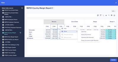
Page builders can produce their view of choice in the UX with ease and efficiency via the right-click action in view-designer. A new context menu is displayed that allows you to show different groupings of items within nested dimensions, such as different line items under cost centers or different products within regions, as well as the choice to Show/ Hide data in non-nested grids. We’ve also added the ability to re-order items based on the sequence they were selected.
All selections are supported across every UX page for Grid, Chart, and Table cards. These work exclusively on custom views and are not persisted after pivoting. They're set up by Page Builders in the view-designer and published to a page for End User consumption.

Context menu options
There are several options available to you in the new context menu, each with different end results. Depending on the data you’ve selected, the following options are available:
-
Hide and Hide Selected, removes your chosen column or row from view. You can hide multiple columns or rows at a time.
-
Hide Every Occurrence, removes all instances of a column or row. For example, you might have a module that contains line items for Revenue and Cost of Sales in every country your company operates. You can choose to hide every Revenue column for each country, from your module.
-
Show and Show Selected displays only your chosen column or row.
-
Show Selected (with re-order) and Show Every Occurrence, displays your selected items in the sequence of your selection. This gives you the ability to re-order while arranging your view of choice.
-
Select items to show, allows you to choose multiple columns or rows to display in your module or classic dashboard.
-
Show all columns and Show all rows resets the module to show all columns or rows that you've hidden.
The important point to remember when choosing the correct option is; applying a Hide will allow new data to be shown while applying a Show will not display newly added data to your view.

Custom view functionality
The custom view functionality within view-designer enables you to design a new view for use in your pages. When displaying or removing data from a view via selections, there are several impacts to the view-designer functionality as a result. When you apply any Hide or Show different groupings of items within nested dimensions:
A warning message will be shown in both panes with 2 pathways of action:
-
The Reset button in the bottom left will reset all selections applied to the selected dimension. This will enable both the Show/Hide and Sort functionality for the selected dimension.
-
A new Reset all columns/ rows button underneath the warning message will reset all selections on the axis of the selected dimension. This will enable both the Show/Hide and Sort functionality for all dimensions on both axis'.
End-User implications
End Users have the ability to customize their display of a grid in the UX using the Show/Hide functionality in the icon bar of a card. When you apply any Hide or Show different groupings of items within nested dimensions, the Show/ Hide feature for End Users is disabled. This eliminates end users' ability to unhide data that the Page Builder has removed from the view.
A warning message will be shown to The Page Builder in the bottom right of the view-designer to make them aware before proceeding.
Are you ready to 'show' your skills in the UX (pun intended)?
Got feedback on this content? Let us know in the comments below.
Contributing author Anne-Julie Balsamo.