One of our team members uses the Anaplan mobile app to view reports on their IPad. I’m in the process of designing a NUX page tailored to the mobile app and I’m running into some issues. I’m hoping you are able to help us solution it.
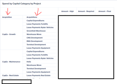
How the NUX card appears in the web browser – and our ideal state. You’ll notice there are two items in the rows section of our pivot for this card

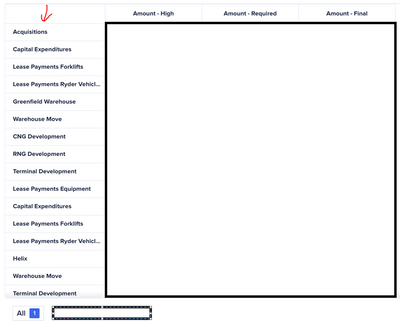
How that same exact card shows up in the mobile app. There is only one row showing from our pivot. I’m not able to get the other to display

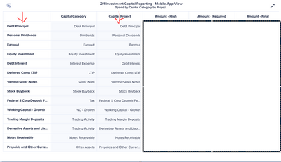
One of our two attempts to remedy the issue. I tried to use the edit function in the UX page to decrease the width of the pivot row (the first column seen below) to near 0, but column width is uniform across all columns in the mobile app so I can’t hide it. The end result is that we have duplicate columns showing

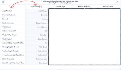
In this attempt, all the information needed is present, but the information appears out of order. Ideally, we’d want the capital category to appear as the column furthest to the left
