The development of Anaplan’s user experience (UX) has been both a major step in the platform’s maturity as well as a key driver of its best-in-class recognition. However, because the UX represented a major change to the dashboard interface during a time when Anaplan had already amassed a large customer base, not all customers have transitioned. I know this because I used to work at one of them.
After my tenure as an Anaplan implementation consultant, I ended up joining one of Anaplan’s earliest customers, a company that had already built a wide footprint based on the classic interface by the time the UX had come out. During my time at the company, we did test the UX across some of our newer use cases. However, as I was leaving the company, we still hadn't fully transitioned. The new company I joined was already using UX exclusively, so I only made the shift on a personal level. Regardless, I still felt it was worthwhile to share my thoughts and perspectives, to help other classic users who might find themselves considering the transition.
Step 1: Understand the context
Many Anaplan customers that are still leveraging the classic interface are early adopters of the platform. At my former company, we clearly understood the superiority of the UX relative to classic. There were just a number of other contextual issues that made the transition a difficult proposition. It’s important to understand these issues as you begin investigating a potential UX migration.
Model supporting elements. The company had its entire Anaplan deployment built leveraging the classic interface. Beyond the actual Anaplan model components, this also included training material, model update processes, and model documentation. While Anaplan has added features to help with the conversion process for the model interfaces themselves, these supporting elements will almost always require work to update. And the longer you’ve been an Anaplan customer, the more work you’ll likely have to do.
Existing visualization support. The company I worked at also had its own proprietary visualization tool, which meant that anything we decided to build in that visualization tool included free training, expert support, and unlimited licenses. Because of this context, our Anaplan use cases all fed a wide array of those visualization outputs, all of which were maintained and updated by report builders. When we were considering a shift to the UX, the key issue that arose was that a portion of our visualization support capability would also need to shift over to Anaplan. And while our report-building expertise was plentiful, the Anaplan expertise at the company was limited. Therefore, it’s important to consider both workforce and expertise factors when assessing the requirements to migrate your Anaplan deployment to the UX.
Implementation lifecycle. The company had been benefiting from Anaplan’s value proposition for several years by the time the UX was released. We clearly had a strong commitment to the tool, but we also had become fairly habituated to Anaplan’s value proposition. While a new Anaplan customer can weigh the full benefits of Connected Planning against the cost of implementation, an existing customer is always going to have a steeper hill to climb.
Step 2: Understand the blockers
If you’re an Anaplan user who has leveraged classic for several years, you’ve likely developed your own habits and routines for dashboard management. As a transitioning customer, the mistake you want to avoid is trying to downplay the changes. Make sure that your classic users are aware of these changes before they start the migration to the UX. That way, they're less likely to become frustrated during the process.
A learning curve exists. The learning curve for the UX isn’t steep — it’s the fact that a learning curve exists at all that'll throw off legacy users. The classic interface was a simple blank canvas that was easy to manipulate, even for the newest Anaplan user. There was very little specific interface training required to understand how classic dashboards worked.
Anaplan’s UX has significantly more features than its predecessor, so there is a ramp-up required to become familiar and comfortable with the new interface. Therefore, when migrating users to the UX, make sure that model builders are aware of this additional ramp up and that time has been allocated for this within the project plan. The Anaplan Academy also has specific training that covers all of the UX features.
The publishing flow is different. Those of us that have leveraged classic for years are used to building modules and promptly publishing them within our dashboards. For many customers, planning cycles would often require this efficiency. While this is still possible to achieve with the UX, the publishing flow is slightly different.

Despite being a relatively small divergence, legacy users who’ve used classic for years are accustomed to more rapid building sessions. Make sure that transitioning users are aware of this difference so they don’t become frustrated during the shift. Set the expectation that habituating to this new process will take time and patience.
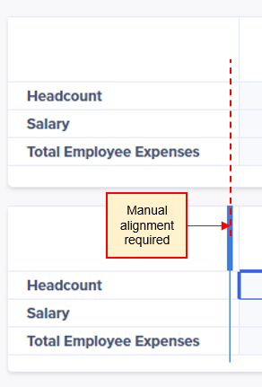
A change in alignment options. The UX was designed with the intention to be flexible and adaptable to mobile interfaces. Therefore, columns within the interface will flex in width depending on the size of the window it is being displayed on. While this is a common feature for many modern interfaces, this can still be unexpected for those who are used to the previous options. In classic, you could define the widths of all columns down to the nearest pixel; however, in the UX there are few alignment options. With that said, the Anaplan dev team is always working **** updates, so I’m hopeful that the UX will continue to progress on these features.

Step 3: Understand the immediate benefits
The enhanced visualization and reporting capabilities of the UX are the most obvious selling points for new customers. However, legacy customers still debating the transition may require additional convincing. This is especially true if they are leveraging a separate reporting platform connected to Anaplan. Therefore, when making the case for the UX, consider highlighting the immediate benefits you receive that require very little ramp-up cost. While these features may be obvious to those that have only known the UX, they'll definitely stand out to long-time classic users.
Cross model interfaces. When working with a complex deployment within the classic interface, users need to frequently log in and out of several models. With classic, any visual dashboard could only be aligned to a single model. Therefore, if you ran a complex deployment that required actions between several models, you had to frequently log in and out of all these models to complete your processes.
With the UX, any given page can now source from multiple models. This means that even if you have a complex process involving several models, you’ll still be able to organize them within a single interface. This approach is less confusing for end users and reduces the potential for navigation errors.

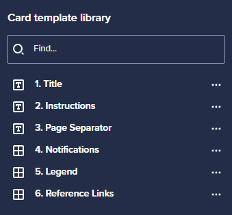
Interface consistency. On one of my more recent deployments working exclusively with the UX, we used a vendor that outsourced to multiple countries. The vendor didn’t maintain controls or consistent communication with their workers. For that reason, our interface pages would vary depending on the part of the world in which it was developed. Despite this hiccup, Anaplan had a simple fix for this problem already built into the UX. With card templates, we could show our vendor the consistency we wanted, from the title and instruction boxes to the legend and reference link tables. This is a simple feature that's very easy to deploy — you can start leveraging it immediately after transitioning to the UX. Not only will it ensure visual design consistency across your interfaces, but it'll also save you time with the interface build.

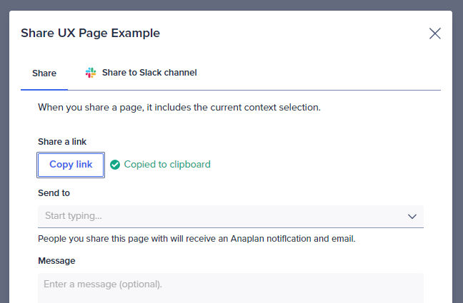
Sharing options. One of the most useful new features of the UX is that all interface pages have a unique URL. This means that any time you need to refer someone to a specific page within a large overall interface, you can copy that link and share it with them. With classic, direct URL links to dashboards don’t exist, so in the same scenario, you’d have to direct them colloquially regarding which model and which dashboard to open.

Final thoughts
If you’re a customer still using the classic interface, it may be overwhelming to think about making this transition! Your loyalty to classic is admirable, but if you haven’t been able to keep up with updates or if you feel you’re missing out on the latest features, it's time to make this move.
While the idea of transitioning may be daunting, it'll feel better to be on the other side of it. A “simple” transition process doesn’t exist because every situation is different. To understand the work required to complete the upgrade, take the time to perform due diligence. Be sure to cover user enablement and the potential impact on dependent systems.
The risk of obsolescence for classic isn't a question of “if” but a matter of “when.” During its original release, it was easy for some of us to brush off the UX as a bunch of shinier charts. But when you look at its current features, you can clearly see that the UX is going to be a primary driver of Anaplan’s innovation. Once you understand the work required, set a deadline to transition. That way, you’ll put your organization on a path to truly leverage Anaplan to its full potential.
Interested in hearing more about the transition from classic to UX? Learn about Facebook’s transition in this session from the ACE event.
About the author: Matthew Kuo
 Matthew Kuo is a Master Anaplanner who has used Anaplan for nine years. He has spent the majority of his Anaplan career working in the high-tech industry working on sales operations, finance, marketing, and HR use cases.