Model evaluation is the operation through which users can estimate the expected performance of a Predictive Insights (PI) predictive model and assess its effectiveness. Since predictions and account prioritization can play an important role in your sales programs or other business initiatives, model evaluation is key and should be viewed as an integral part of the modeling process.
In this article, we’ll describe three key PI model evaluation techniques.
Model Quality Chart

The model quality chart describes how well does the model generalize data, namely its ability to accurately predict the conversion outcome of new (unseen) accounts. The following section describes the different components of the chart:
- X axis: Shows the coverage of all of the accounts in the dataset, both customers and prospects, sorted by score in a descending order from left to right. Therefore, for example, the 0.15 mark represents the top 15% scored accounts and the 1.0 mark represents all of the accounts. Note that the A and B rank score range is highlighted in color.
- Y axis: Shows the recall, or the percentage of customers in the dataset for each value of coverage of all accounts (the X axis). Therefore, for example, the 0.7 mark represents 70% of all customers available in the dataset and the 1.0 mark represents all of the customers.
- Model line: Shown in orange. Represents the model recall (true positive rate) for every percentage of coverage of the scores. The score values range from 0 to 1.
- Test line: Shown in red. Represents the recall of the test set. The test set is a random sample of data that PI automatically withholds from the original data in order to estimate the quality of the model after it has been trained. A test set will only be allocated if there is a sufficient number of accounts in the training set (over 140 unique accounts).
In technical terms, the chart represents the recall as a function of the coverage of accounts in the dataset.
Users can evaluate their predictive model by reviewing the model quality chart and consider the following points:
- Generally, higher accuracy values indicate that the model is more effective in predicting the conversion outcome for prospective accounts.
- The model should have a relatively steep increase in recall as the coverage percentage increases, and maintain a high recall score at the top end of the coverage.
- Consider the diagonal from the origin (where the axes intersect) to the top right corner of the graph. If the model's performance falls below the diagonal, it means that the model is performing worse than random chance, and it will most likely require further refinement or taking a different approach in respect to the use case. However, if the model's performance is above the diagonal, it means that the model is performing better than random chance and was able to glean useful information from the data.
- Ideally, there should be little to no difference between the performance of the model on the train data and the test data, indicating that the model is neither overfitting nor underfitting. This would be represented by the two lines overlapping or closely following each other throughout the entire range of coverage.
Since every business use case and dataset is unique, there are no exact specifications on what the actual accuracy values should be; In some scenarios the model would more easily identify distinct attributes to more effectively distinguish between customers and prospects – which would translate to stronger performance and better accuracy. In other scenarios, high and low accuracy values may indicate overfit and underfit behaviors, respectively.
Score & Rank Distribution
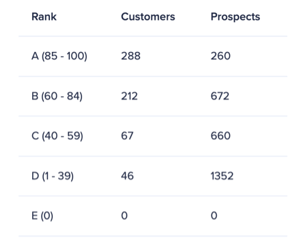
In this evaluation technique we examine the details available in the ‘account prioritization’ tab of the predictive model. We generally wish to see an account distribution where the number of customers is largest for the top rank (A), where the lower the rank is – the smaller the number of customers. The trend should be opposite for prospects, where the number of prospects is largest for the low rank (D), and it gets smaller the higher the rank gets.
Note that for the purpose of this technique the E rank should be ignored as it represents accounts that can’t be scored. Also, this technique applies to the default score thresholds, where the A rank is defined as 85 - 100, B as 60 - 84, C as 40 - 59, and D 1 - 39.
Predictive Score Sampling
Predictive score sampling is a “sanity check” technique in which users evaluate the model by assessing the validity of predictive scores. In order to perform this check, users should go through the following steps:
- Export the scored prospect accounts data from PI.
- Sort the data by score.
- Randomly select 5-10 accounts from the top-scored accounts (90-100) and 5-10 accounts from the low-scored accounts (1-10).
- Consider how well do the accounts align with your business goals and check whether they are reasonably scored accordingly.
With effective predictive models we expect the strong-fit accounts and low-fit accounts to be assigned with high and low predictive scores, respectively. The guiding principle is to look for a logical fit but not a perfect fit across all accounts as the models are statistical in nature.
Note that this technique is suitable in instances where users are familiar with the underlying use case and business goals associated with the model.
In summary, we recommend following all three evaluation techniques with every model built with PI. Please note that as with any predictive model – make sure to build it using data that meets the requirements and is suitable for the use case in question.
