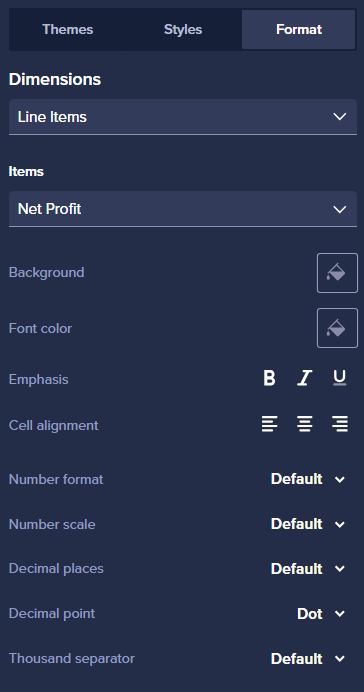
In most cases, especially when adhering to accounting principles, it's preferred to display negative numbers in red font, similar to how Excel handles them. Currently, achieving this in Anaplan requires setting up conditional formatting for each line item, which can be time-consuming and inefficient.
To streamline this process, it would be extremely helpful to introduce a toggle in the UX page formatting section that automatically changes the font color to red for negative values. This enhancement would offer two key benefits:
- Free up conditional formatting logic for other use cases (e.g., borders, Morse indicators, background colors), while still ensuring negative numbers are visually distinct.
- Significantly reduce UX design time, making page building faster and more intuitive.
Even better, this toggle could also be available at the card level, similar to how default column widths are set for grid cards with the option to override specific columns. This would make UX design even more seamless and save substantial time for page builders.
