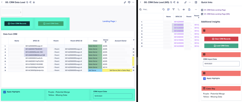
Right now each card still shows if it is an Action/Field/Text/etc…. when placed in the Additional Insights (in red). Those same Cards look so much nicer on a Board right now, as they don’t have this extra stuff up top (in green).
I actually added a Title to one (Color Key) just so it doesn’t look like wasted space as much. But I would go without the Title if it would just show the Text.
