Introduction
With the addition of the Report UX page type, it is now possible to create highly formatted, customized slides to deliver key insights and clear reporting to your organization. As with many Anaplan features, our customers always come up with innovative ways to use this feature and this post will look at two of those:
· User Guide
· Landing Page
Before we dig into these, if you want a refresher on the capabilities of Management Reporting, the following Community article will tell you all you need to know: [Start Here] - Management Reporting
User Guide
Text cards can be placed anywhere on a Report Page and have enhanced formatting capabilities. When combined with newly released Shape card, you can provide guidance notes for the pages in the application. Customers will usually create end user documentation in separate applications, but the advantage of using the report page is that you stay within the application and can easily navigate between the page and the notes.
Creating a User Guide Report Page
1. Take a screenshot of each page to be included in the guide and store this in an accessible location. There is a great Community article on image storing at the following link: Hosting Images on Google Drive, Box, or Sharepoint
2. Create a Report Page and add the screenshot as an image to the page.
3. Add Text Cards for each area that requires documentation.
4. Add Shape Cards to highlight documented areas and arrows to link the text with the subject area. For more information about the new Shape Card see the following video: Management Reporting: Introducing the new Shape Card
5. Add a link back to the UX page.
6. On the UX page add a link to the User Guide Report page.
Example
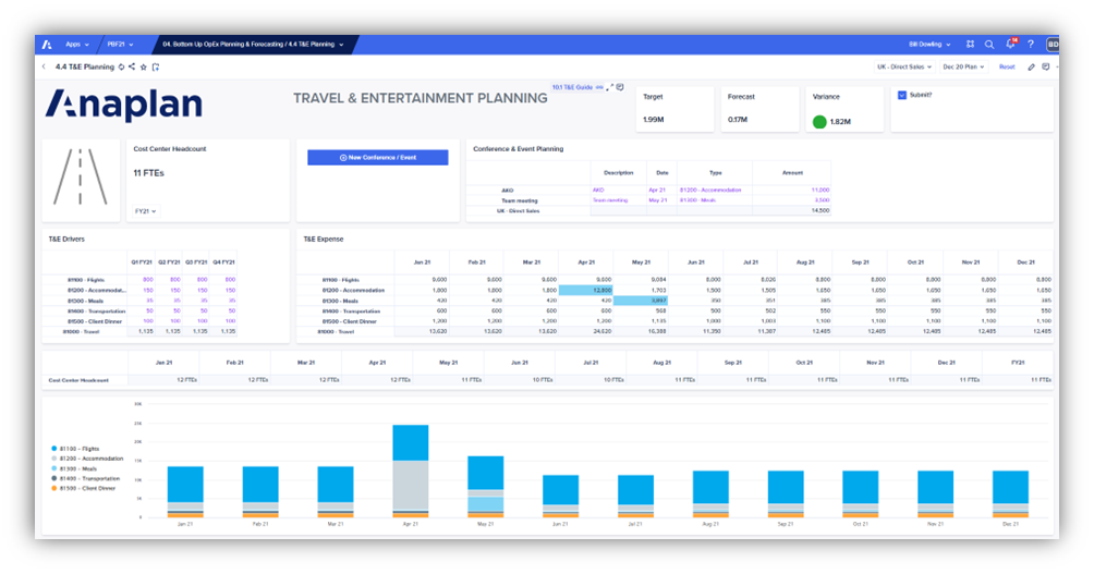
The first screenshot below shows the original UX page with an Icon link to the User Guide page.
The second screenshot shows the User Guide page with the link back to the UX page at the bottom of the page.


Note
The UX navigation will take you to a Report Page, not a specific slide. If you are happy with the navigation taking you to a general User Notes page and then selecting the relevant slide, then only one report page is required.
If you prefer each page link to go to the specific User Guide for that page, you will need to set these up as separate Report Pages.
Landing Page
This is not a new concept and I have always found Landing Pages very useful. Originally used in Classic Dashboards, then on Board Pages in the UX. The benefit of using a Report Page is the flexibility you have on how and what information you display. It can be a much more intuitive way of guiding an end user through the process. The page can also serve as an agenda to help give you a structure to any information you need to present to a wider audience.
Creating a Landing Page
It is very straightforward to create a Landing Page. Typically it will be a mix of Text cards and Image cards. The new Shape card can also be used to enhance the appearance.
It is also up to you how you arrange the Report pages. Some customers prefer a single page with a slide for each process. Others prefer a separate page for each process. This option can be useful if you want to control the access to the pages as this cannot be done at slide level.
Example
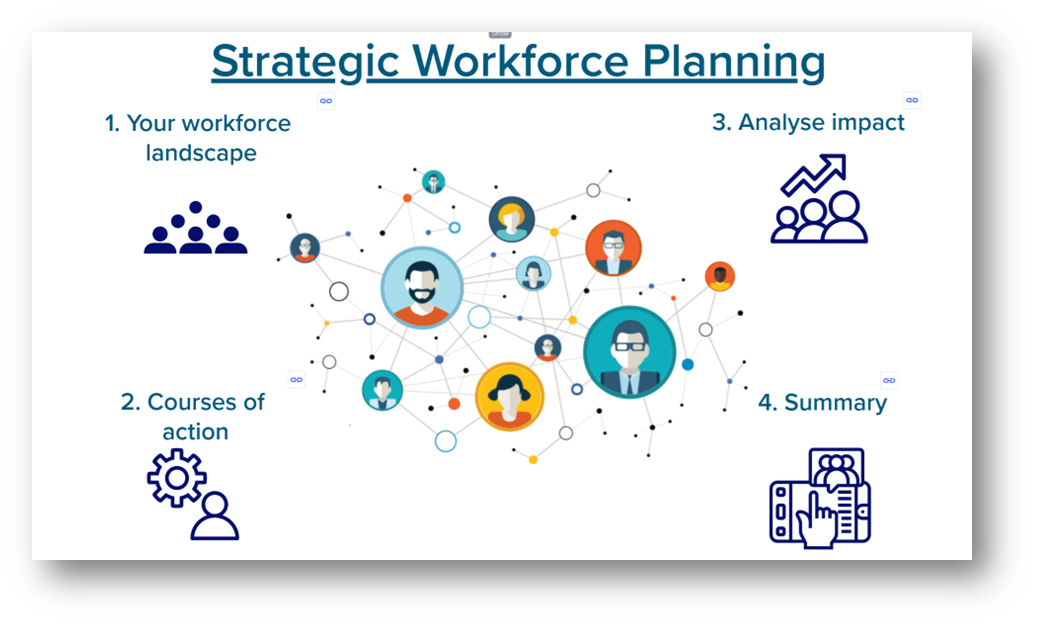
The screenshot below is using a combination of images and text cards to guide the user through the strategic planning process. Each Text card has a link to the relevant UX Page.

Conclusion
As we often see with Anaplan features, they can be used in many different ways. The introduction of the report page has provided many options for presenting data in a visual and intuitive way. The ideas above provide the end user with a way of guiding them through a process without having to leave Anaplan.