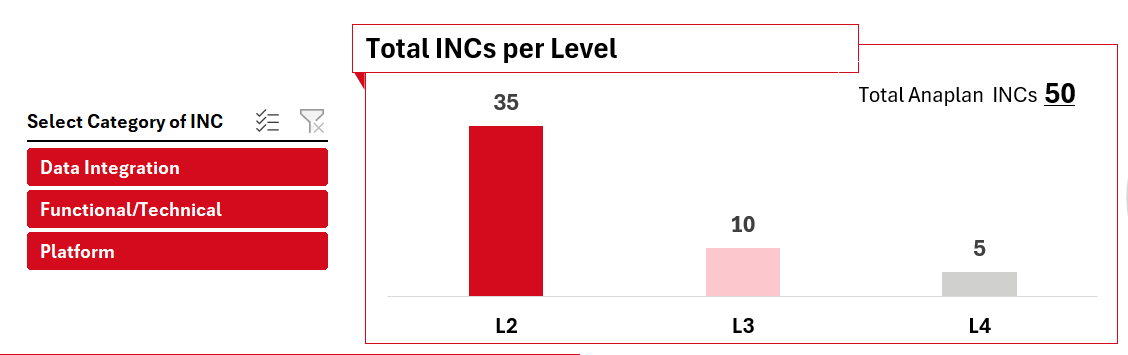
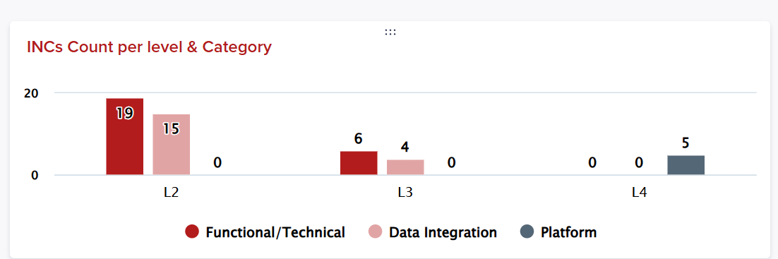
Hello , do you have a better idea to better represent the below chart , as you can see there is zeros that I want to hide and want to add some kind of slicer and want to make it look a little bit like the UX design below that we previously had in excel , let me know your thoughts,,,thanks…..
let us not focus if the numbers are not the same but want to have same view as much as possible
Anaplan ux page:
UX design we had in excel: