Provide your users with a seamless, intuitive, modern experience for them to plan more efficiently in a collaborative way, at their desks or on the move. Present and distribute pixel-perfect, visually appealing reports to stakeholders.
The Anaplan UX (formerly new UX) has been with us for over two years now. Since it was launched, a huge amount of investment has gone into development, adding and enriching features at an impressive pace. This investment is set to continue for the foreseeable future, with an exciting roadmap ahead (for a sneak-peak of upcoming releases, check out this page).
If you are just starting your Anaplan journey, we strongly encourage you to consider the UX as a default. There is little to be gained from learning the legacy “Classic” dashboarding capabilities, nor building or deploying applications using them.
Similarly, as an existing customer looking to build out new use cases, the default path should be to the UX, to maximize adoption and provide the best experience for your end-users.
But if you are a customer who already has an extensive estate of Classic dashboards, is migrating those applications to the UX a compelling enough proposition? What positive business outcomes can be anticipated in return for the investment of time and resources required? The rest of this article explores this question.
Why transition to the UX?
Firstly, let’s be clear that migration should be treated and managed as a project. As a reminder, we encourage you to follow the USER methodology as a framework.
The UX has a very different design paradigm to Classic, and so we do not recommend a ‘lift and shift’ approach as it is unlikely to deliver the full value of your project.
Migrating to the UX presents an opportunity to revisit existing processes and improve upon their execution, by re-designing to the strengths of the UX and utilizing new features not available in Classic.
To make the transition easier, you can leverage views and charts from your existing dashboards. We have a dashboard import tool that helps to speedily copy templates you already have in Classic to the UX, ready for use in your new apps.
To find out more about the dashboard import tool, click here.
So, what are the business benefits of migration? How does it enable us to plan better, faster?
Well, you can start exploring our Community page, check out the Trainings and Resources, discuss with your peers and then look at some general reading on features here.
Navigation
For a planning application, adoption is key to its’ effectiveness. To encourage this, end-users should be presented with as seamless a process as possible, facilitated by a UX which is easy to use and intuitive to navigate. They need to have no notion of models, modules, or other technical constructs underpinning their experience, but just focus on the process at hand. In the UX, pages are grouped into Apps to facilitate business processes in a more seamless way, by leveraging data from multiple Anaplan models. In Classic, each application can only be serviced by a single model, meaning that your users may have to navigate to different places to complete their tasks.
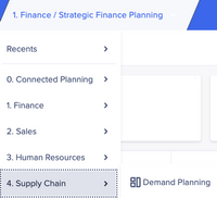
Using the native “breadcrumbs” menu, users can easily find the pages they are looking for.
In this example of Connected Planning, the pages within each category are connected to different Anaplan models, but the users can seamlessly transition from one area to another, a far more efficient experience.
In addition, links to other pages can be embedded anywhere in the App, making getting to the right place even easier.
Quicker decisions
Getting the right information to the right people at the right time has long been the quest for planning and reporting solutions. The quicker that fact-based insight can be attained, the faster effective decisions can be made, plans altered, and subsequent actions are taken. The UX is more performant than Classic in key areas. Page selectors are faster, as are large grids of data. But it is the capabilities of the features of the UX which can really facilitate faster decisions than Classic.
Now, there are 3 types of pages in the UX: boards, worksheets, and reports.
Boards help you to visualize the data using charts to detect trends, and KPI cards which draw the eye to what is most important and worthy of further investigation. Enhanced conditional formatting improves the experience within grids when highlighting important areas.
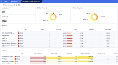
Worksheets facilitate analysis of larger data sets, with all the filtering and pivoting capabilities you would expect, but with added context through content surfaced in the accompanying Insights Panel.
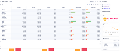
But it is perhaps the third page type that distinguishes the UX from Classic the most.
Reports allow you to create highly formatted, customized slides to deliver key insights and clear reporting to your organization using the new presentation mode in platform. With the flexibility of report pages, you can quickly convert presentations into multi-page PDF packs and share those key metrics with all stakeholders. There is nothing akin to this in Classic.
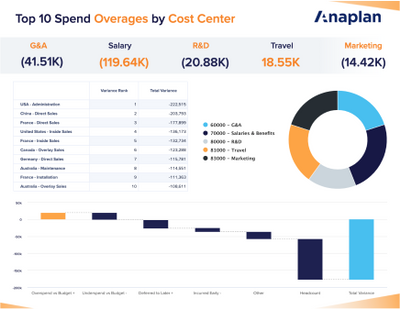
For an overview of when to use which type of page, check out this article.
Collaboration
Planning better demands efficient collaboration between team members. There are several great features, unique to the UX, that assist with this.
- Comments can be added to any card on a page, specific to the context being viewed. Individuals can be @mentioned to draw them to an action or observation
- Notifications enable users to email collaborators from within an app, for example to alert them to perform a task
- Pages can be shared by email, with context, to easily loop colleagues into the process by taking them to exactly the right place
- Integration with Slack to share pages with more colleagues
When collaboration is made easier, discussions are faster and so are the resulting decisions.
More detail on collaboration features can be found here.
Mobile
For people on the move, the use of the Anaplan mobile app can greatly increase efficiency as the transition from desktop to mobile is seamless. Anaplan apps and pages, designed for mobile users, render automatically in the IOS / Android app to enable data analysis and interaction with the process direct from a phone or tablet.
For many use cases this offers substantial benefits over Classic, which is wedded to the desktop.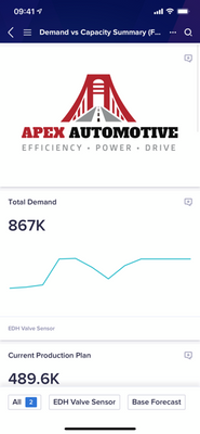
If you are interested on Best Practices for Mobile page building, click here, and for more details on getting started with mobile, click there.
Conclusion
The UX is the obvious choice for any new use case, but it is also a compelling proposition for re-imagining and improving on existing use cases. Migrating from Classic, done well, can deliver tangible business value, as well as putting your whole Anaplan footprint in the position to benefit from the substantial further roadmap of developments coming your way!
Contributing author Andrew Martin.