New UX Gantt Chart: show more metrics
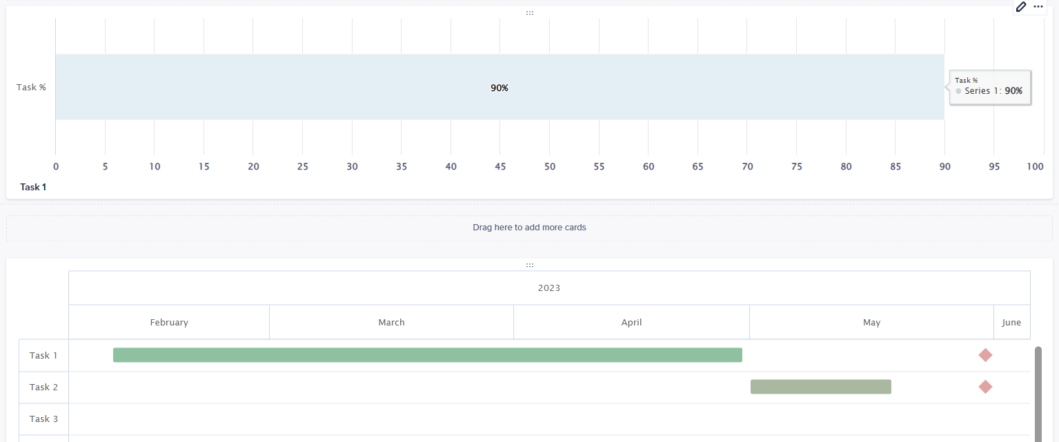
When you have a Gantt chart and you move the mouse over it, it shows the period’s starting and ending dates. It would be great to have the ability to show other custom metrics as well (values, states, ext.)
As is:
To be something like:
So then number of Line items in tooltips to be flexible and color selectable.
Tagged:
10
Comments
-
I agree! It would also be great if you could show these metrics in the bar itself, as it the case with bar/column graphs.
1 -
Also, it would be great to show the dependencies between particular tasks in Gantt charts with connecting arrows between tasks.
0
Get Started with Idea Exchange
See our Submission Guidelines and Idea Evaluation Criteria, then start posting your own ideas and showing support for others!