Find here our recommendations on Best Practices for Management Reporting:
1. Design an attractive cover page
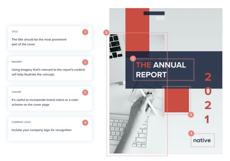
When designing a cover page, the main elements you want to include are:
Title
The title should be the most prominent part of the cover. It’s good practice to keep these short and concise. At this point we want to explain exactly what your report is, without delving into any of the details.
Imagery
Consider including imagery to improve its visual appeal. Using imagery that’s relevant to the report’s content will help illustrate the concept.
Colors
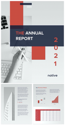
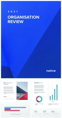
It’s useful to incorporate brand colors or a color scheme on the cover page. These colors can be used throughout the report for a consistent style.
Company logo
If it’s relevant, include the company logo. This shouldn’t be too extrusive as the most relevant content should still be the title. However, it’s good to include a logo somewhere on cover page for brand recognition.
2. Spacing and layout
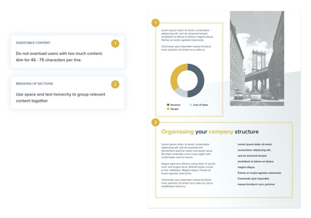
Spacing and layout are the most important aspects when creating an appealing report. they help to structure reports into consumable areas and breaks up content so it’s easier to understand.
Often novice report designers will add as much content to the page as possible in a bid to get all the information on one page. However, this leads to information overload and can cause readability issues. For example, the optimum number of characters for scanning text is between 45 – 75 characters per line. This isn’t a strict rule but when adding large areas of content, it’s a good one to stick by to keep your consumers engaged
3. Text hierarchy
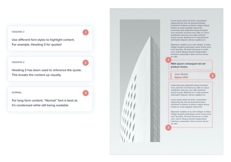
Like spacing and layout, text hierarchy helps break up content into digestible chunks.
Anaplan provides 5 levels of hierarchy when creating reports. These styles make it easier to structure content and they provide consistency throughout your report.
- Normal
- Instructions
- Heading 1
- Heading 2
- Heading 3
4. Visuals
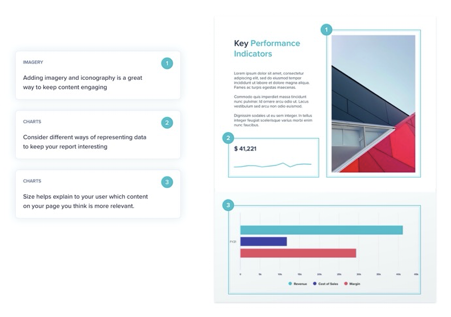
Adding imagery and iconography is a great way to break up long form content to make it more engaging. They can also help emphasize your narrative.
Other visuals to consider are data visualizations such as:
Using data visualizations let readers understand and interpret data with ease. As well as this, it’s a great way to highlight the most information to the consumer.
5. Color
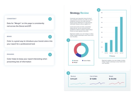
As mentioned on our Cover Page, implementing a color scheme or introducing brand colors into a report allows for a consistent and professional looking report.
Color also plays a major role in highlighting important the areas you want readers to focus on, while breaking up the content into consumable areas to aid readability.
Other cool examples...
... to start your Management Reporting journey.
Are you ready to start using Management Reporting in your Apps and Pages?
Got feedback on this content?
Let us know in the comments below.
Author AJ Balsamo.
Contributing authors: Edgar Gomez and Jamie Gargette.