A customer recently asked me, “What ease of use features are available in the Anaplan user experience (UX) to help drive end user adoption and engagement?” The customer was about to roll out Anaplan to a large number of first-time Anaplan stakeholders and wanted to do everything possible to ensure excellent end user adoption. To answer this question, I put together a list of recommendations to help make a great first planning cycle impression with your Anaplan end user stakeholders.
Start faster
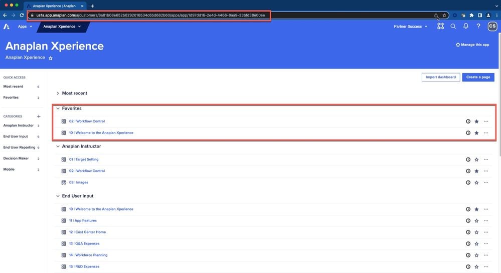
Get your end users to the starting line with fewer clicks. When new users are added into an Anaplan workspace, an auto-welcome email is sent with a workspace login link that directs them to the Anaplan home page. Users then may need instructions on where to go next. You can now show and hide apps, pages, and models using the 'eyeball' in the tool bar on the home page. To start faster, provide end users the Anaplan app URL and have them bookmark the link. On the app contents page (shown below), users can star favorite pages or use the search tool to find specific content.
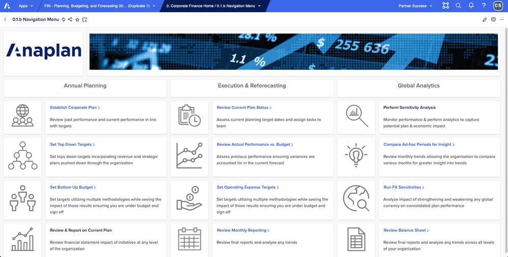
Some customers opt to provide users with the URL to a custom UX home page within the Anaplan app that contains descriptions and links to other pages in the app as below:
Other ideas:
- Build a custom UX ‘landing app’ with a page and leverage grid or field cards containing clickable links to other UX apps. This can easily be done using text formatted line items with URL data in a System Module. The benefit is that end users can bookmark the one ‘landing app’ using a static bookmarked URL and use that page to launch other UX apps. This is a workaround for customers who create new production apps as part of an ALM process; the URL only needs to be updated in the landing app. Below is a rudimentary example showing links in a grid card and the same links with labels in a field card.

- Some customers leverage enterprise link management solutions such as GoLinks. These tools provide flexibility to organize, edit, analyze and have complete control over internal and external links.
Less is more
Your Anaplan applications may have dozens or hundreds of pages. Not all pages may be relevant to all end users. Admins are able to restrict access to pages so end users only see pages relevant to them.
Naming conventions
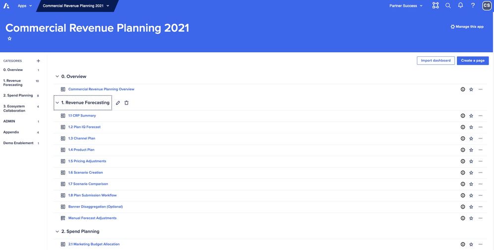
What’s in a name? Anaplan app, category, and page names are very important to get right. Names should resonate with end users and inform of the business process and purpose. Keep names succinct and consistent. Categories and pages are automatically sorted alphanumerically so using a number prefix helps keep things in good sequence.
Build help pages
Create pages dedicated to instructions and documentation. Leverage text cards, images, and even .gifs! (video snippets). Help content can include any combination of the following: business process diagrams, planning calendars, data integration schedules, detailed narrative instructions, FAQs, video gif snippets with prerecorded page demonstrations, roles and responsibilities matrices, business definitions, custom image/icons, or team support contact information. Pages can also be used to describe standard Anaplan features such as page navigation, explanation of Anaplan font colors, export instructions, commenting, right-click features (e.g., for copy across/down, breakback, show history and drill down), share page, etc. Lastly, use dynamic text formatting for boards and worksheets make more impactful instructions.
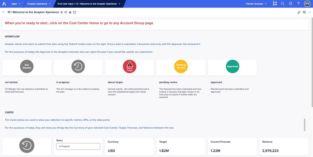
Below is an example of an app help page with image definitions, help narrative, and at the bottom and image and a .gif at the bottom showing how to enter data into a G&A grid.
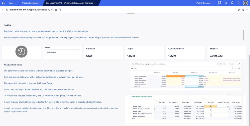
In the below help page, bottom right, there is a .gif showing the end user how to interact with table. This can be conditionalized to display multiple different 'how-to' videos in the same page location using boolean check boxes to allow the end user to choose from a selection of different .gifs.
 Hover over descriptions
Page builders should leverage Anaplan tool tips to provide hover over text descriptions for cards on board and report pages. Card descriptions display when users hover over the blue information icon in the upper right corner of the card. Quick and handy helpful text display for end users without using on screen space.

Unconditional conditionals
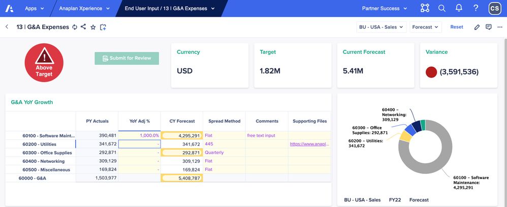
Most models use conditional statements in calculations and logic. Did you know you can also use conditionals to help end users understand what they need to on a page? Try using status indicators (e.g., “not started, pending review, complete”), reminders (e.g., “Please add a comment”) and alerts (e.g., “Above Target”). Line items with conditionalized images that change based on data inputs can be very helpful for end users. Below is an example where the ‘Not Started’ image changed to 'Above Target' when the end user entered data that exceeded a budget threshold due to the 1000% increase in the 'YoY Adj%' column for software maintenance. Notice also that the 'Submit for Review' button is greyed out and the user has to change the budget numbers before being able to submit for review. Conditional images or formatting can be used to indicate if a user has entered data. In this model, when a user choses a spread method the 'Not Started' image (shown above) changes to a 'Work in Progress' clock image. When a user clicks the 'Submit for Review' button, the images changes to Submitted (not shown).
Further down the page, the end user entered a manual adjustment amount of $1,000 for April 22. This triggers conditional formatting to engage a yellow border on the 'Final Expense w Overrides' row, indicating something has changed from the Initial expense and additionally triggers on red border format to highlight the comments cell, indicating an explanation is required for the manual adjustment.

Once the end user enters a text comment as data, the red conditional formatting is cleared.

Care to comment?
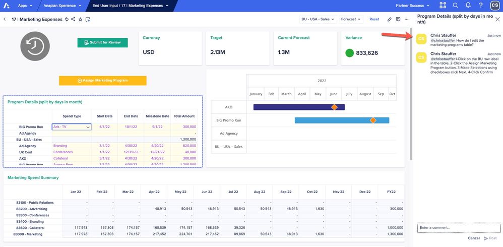
On page conversations can speed up information exchange and increase collaboration. Leverage the Anaplan commenting capability and have real time conversations with users directly on the page about specific cards on the page. It’s possible to use commenting to provide help instructions as well. Comment recipients will receive a notification mentions and can quickly join in a conversation to help keep the planning process moving along smoothly.
Link out to external help content
Use grid or field cards with text formatted line items with URLs to external custom training content. End users simply click the link to access external content on Box, Sharepoint, web pages, etc.

Help users help themselves
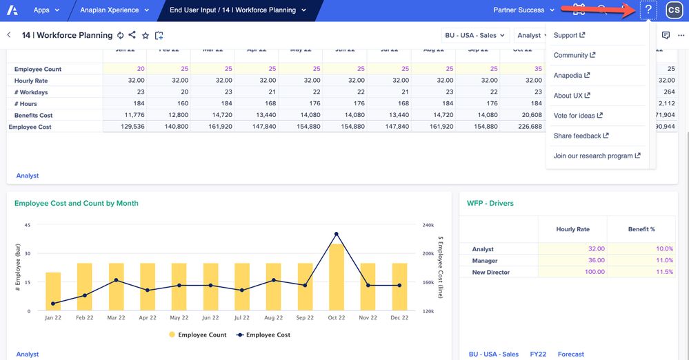
In the upper right corner of the Anaplan UX banner, you’ll see a white question mark button standard on every page in the UX. The question mark is a pull-down menu with links to Anaplan Support, Community, Anapedia, About UX, Idea Exchange, Share feedback, and the Anaplan research program. End users love to provide valuable feedback and enhancement ideas and in doing so are more engaged.
Help, I need somebody!
Sometimes users just need a helping hand to help get unstuck. Having an email button on a page so end users can send questions and screen shots can be efficient. Of course, you’ll want to have someone on duty to monitor and respond quickly. For Slack users, there is a Slack integration feature available for instant sharing.
Friendly competition
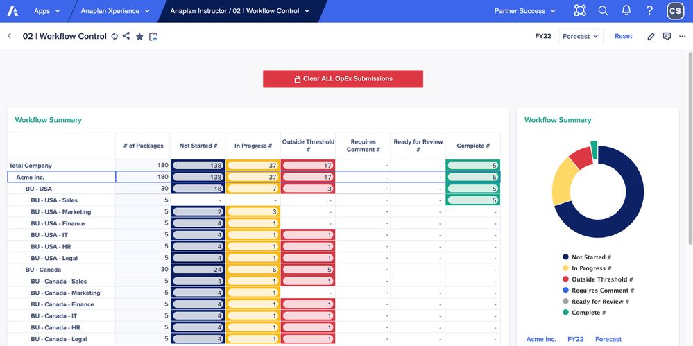
This was a customer suggestion: 'gamify' the planning process with end users' or teams' 'name in lights’ on a ‘scoreboard’ page. In other words, positively call out end users or teams who are engaged with Anaplan and have completed their planning tasks on time or ahead of schedule. Below is an example of a workflow summary page where the BU - USA - Sales Cost Center has completed all required submissions.
We'd love to hear your ideas in the comments below. If you liked the UX pages displayed above, this model and app are available to customers at no cost. Please message me for details on how to obtain your copy.
Happy Anaplanning!
Contributing authors: Anne-Julie Balsamo, Ryan Kohn, and Elizabeth Schera.