
Author: Aaron Overfors is a Certified Master Anaplanner and Principal Architect at Spaulding Ridge.
In my first article, we detailed how to create a robust design for the user experience; now comes pulling it all together and building the actual pages! We will examine the concepts and ingredients of a strong page to focus your users, as well as techniques and approaches to avoid in order to not cause confusion to them.
Dashboard layout
To begin, it is generally best to have a defined starting point or Landing Dashboard, depending on the role type. Landing dashboards should have a hub-and-spoke approach to allow users to take action where necessary and easily return to a summarized view.
Generally, dashboards should help the end users to draw insights from the model and provide the means to do their jobs intelligently and easily.
- Create a clear navigation path for end users. Start with a landing dashboard that links to the next dashboard/step within the process. Numbering the dashboards helps users know where they are and what is next in the process (if there is a linear flow to the business process).
- Be consistent. If users are used to seeing a title, instructions and logo on every dashboard ensure every dashboard contains a title, instructions, and logo. This is visually more appealing and will allow users to feel more comfortable working within the tool.
- Clear instructions will prevent future headaches and reduce questions. Determine a format for instructions and consistently place those instructions on every dashboard near the very top.
- Generally, a tops-down and left-to-right flow to dashboarding works very well. Start with a high level and progress to more detail as they move down and to the right through the dashboard.
- The ultimate test of sound dashboard layout is whether someone who is unfamiliar with Anaplan can open the dashboard and use it without struggling. This should be the goal. It does not matter how great the architecture is and how impressive the functionality is; all your hard work will fall short if the final product (dashboard) is viewed as clunky and confusing. Dashboards are the ultimate object with which end users interact and what they use to form an impression of the tool.
- Additional tips:
- Real-time data synchronization vs planned data imports should be clearly indicated if both exist on a dashboard (or even within the App).
- If two models exist within the same application, indicate that model 1 does not feed model 2 automatically (real-time).
Specific starting point
- The layout of the page should clearly convey and communicate where the user should start on the page and the intended points of interest/order an end user should follow to complete their given tasks on the page.
- There should be page and card grid titles that indicate the specific purpose of a page and card grids.
Specific areas of focus and actions to take
- It should be clear what data needs to be understood and what actions need to be taken based on the page which the user is on.
- Therefore, end users should be able to clearly and quickly understand what their roles and tasks are on the page. Whether it be for analyzing data, inputting data, or running actions.
- There should be a clear definition of which roles will be users of a page.
- A good test is to see if a page can be explained in a concise sentence.
Page instructions
- Each page should provide clear, concise instructions of what an end user will need to do and what steps they should take to fully utilize the page.
- For smaller pages, instructions near the top of the page will suffice. For a larger page with multiple points of interest, multiple instruction cards may be helpful, placed near their intended grid/card/module.
Visualizations appropriately placed
- Typically, each board should have data visualization components which allow end users to quickly assess and understand data/inputs.
- Visualization can include a degree of subjectivity, so model builders should communicate with end users on what they would like to see.
Elements should be presented clearly
- Titles on grids (rows/columns) should not be cut off.
- If the contents of a grid can be displayed in a reasonable amount of space, expand the vertical height to display the entire grid so an end user does not have to scroll within the grid.
- Chart legends should clearly display all items.
- Chart axes should be cleanly labeled.
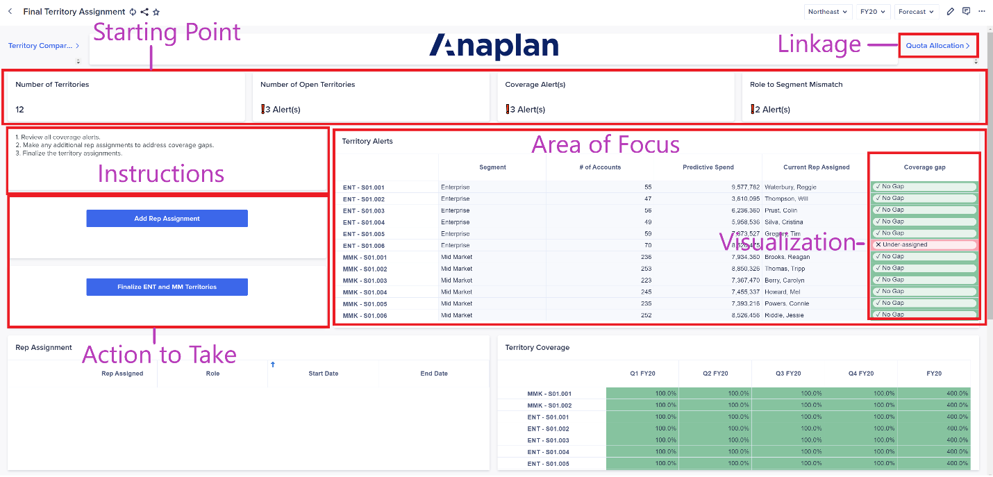
Image: User experience schema
Common dashboard mistakes
- Too many charts or unorganized grids creates visual clutter.
- Basic questions such as “what is the total amount of sales?” take much more than 5 seconds to answer.
- No organizing principle behind the visual layout — cards seem to be strewn randomly.
- Tables in the bottom add very little business insight.
Review the below example:
Some problematic design aspects in this dashboard:
- There are no instructions or labels, which makes the purpose and function of the dashboard unclear.
- There is no focal point for the user, so it will take time to review the dashboard and figure out how it should be used.
- There are card titles, but no headers or dividers to help organize the dashboard.
- The layout does not intimate a flow, which makes it difficult to tell which steps are next.
- The title is on the far left and is not fully displayed leading to a scroll bar to be show on the card.
- There are missing images on the dashboard, missing card dimension labels and card titles.
- There are random images that do not align to the content of the dashboard.
- The colors don’t match across the dashboard and should be consistent between titles, grids, and charts.
Takeaway
Remember that effective dashboarding allows for a smooth user experience and tells a comprehensive story across the app as it enables its constituent business users to perform their planning functions. Each UX page should have a meaningful part of that planning story and be clear, concise, and purposeful in its objective. Simplicity is key; a high volume of dashboards in an App typically comes from a lack of proactive planning on their collective purpose. Purposeful planning of the UX typically results in fewer but more impactful pages, allowing planners to do what they need to do most effectively in an efficient manner.
What tips would you add? Leave a comment!