Overview
One responsibility of a marketing team is creating and regulating the corporate brand standards. Logos represent the most recognizable part of this tool kit, but the choice in color can be equally important when consumers are challenged with recognizing popular companies. McDonalds: Red & Yellow. Starbucks: Green & White. Coca-Cola: Red & White. Without much effort, consumers recall brands without their logo, but just by a color palette. However, for McDonalds it’s not just red & yellow. The red is hex color #DA291C and yellow is #FFC72C. As the visual below proves, without the correct red and yellow the color palette does not match the brand identity. It is close but does not appropriately represent these standards.

Equally important and often less recognized, a company’s brand standards are a marketing tool to employees. The right logo and correct color palette are often communicated to internal customers through keynotes, on their security badge, or in the color of a uniform. When a company designs a new logo or modifies their color palette, it is communicated that departments should prioritize modifying their own decks, email signatures, and business cards. Therefore, it’s imperative for model builders to continue to communicate this color palette in Anaplan through selecting the appropriate hex codes on graphs, management reporting, and conditional formatting. A previous limitation to classic Anaplan dashboards with that only a select number of colors or shades were allowed to be created; the UX solved this limitation through the incorporation of hex codes. This valuable change ultimately positions Anaplan as a tool that helps the Anaplan build team continue to communicate a brand’s corporate identity.
The problem
We’ve all been there – searching for the corporate brand hex codes that you received in one email or during one keynote send companywide to communicate the new design change. Or maybe you’ve been the new person on a team and or the peer of the new person who can’t find that internal website or email that announced the brand standards change. Then you all spend way too much time locating the email or reaching out to people, so you resort to picking a color that is close enough. True story: I once uploaded a screenshot of a company’s website into a hex finder tool and got the wrong hex codes. Someone always notices, or this happens repeatedly, or everyone ends up choosing different variations of red and yellow, so end users end up focusing on the inconsistent color palette instead of what the model is communicating. This creates the question – could these brand standards be in Anaplan, ultimately allowing the tool to support the corporate identity, while also making it more efficient to maintain consistency in graphs, conditional formatting, and title color accents across the model?
Solution
The short answer is Yes. The long answer is Easily! As with most aspects of Anaplan, it comes down to staging and storing values in Anaplan that will be used to maintain the brand standards.
Hex codes in the UX fixed a significant limitation to the classic interface. Before the UX we spent too much time mixing red and yellow and guessing what number in a range will make the right color of orange. We got ambitious by adding green into the mix if you went with the three-color option.
With hex codes, we start with a better starting color palette. Not only do we change from 6 default colors to 36 colors before mixing but have a world of opportunities added with blank line at the bottom.
If your team has decided to take advantage of an alternate color palette based on the company’s corporate color palette, the little white line will get more use than the default 36 – which is why this How To focuses on creating an extended color palette in Anaplan.
Build
In order to build an extended color palette, or a brand standard corporate color palette, you will need:
- One module
- One worksheet (can be a board, but I recommend a worksheet)
- Copy of brand standard hex codes
The goal is to only need that brand standard hex codes for the build. All other information that is distributed will just be incremental, and the team will have a centralized location in Anaplan to modify.
Step 1) Build the module
- Use the brand standards to identify how many colors you have been provided by your marketing team
- Add that many lines into your module (HINT: If you use a few shades of yellow, name the line based on what is the primary yellow vs. secondary or tertiary)
- Format each line item as text
- The formula for each hex code line must be written out as “#_ _ _ _ _ _”, with the quotations making the line be the formula.
- NOTE: protects the lines from accidentally being edited, but technically you don’t need to write these as a formula as long as it’s a text box.
- Add one number formatted line at the bottom named “CF” and write the formula as 1
- Push the module from Dev to Prod

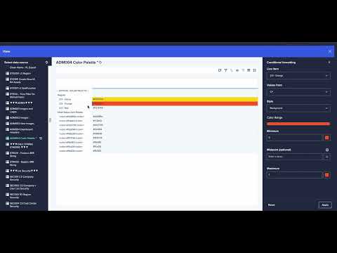
Step 2) Build the worksheet (it can be board, but the scroll ability as the color palette increases makes a worksheet easier to manage)

- Add the module onto a new worksheet. Each line item will show just the code.
- In the page builder access, select the first line on your module and go into conditional formatting.
- Choose that the values from that CF line and leave the style “background”.

- Set minimum to 0 and maximum to 1

- Using the code that you can see on the line item copy the hex code and paste it into the blank line for both the minimum and maximum and apply. Repeat for all hex code lines.
After all hex codes have their conditional formatting applied, your end result will look something like this (with the appropriate color palette):

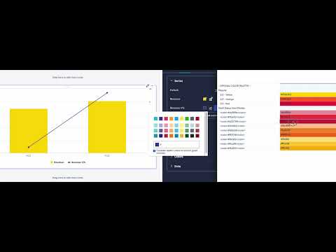
Step 3) Apply on a dashboard
- Open color palette worksheet in a separate window
- Identify the color we use on graphs
- Copy and paste hex code directly from color palette into the graph color selector
Having the color palette in Anaplan makes it easy to change this:

Into this:

Conclusion/next steps
This worksheet now houses the brand standards for my company in one centralized location in Anaplan. I can modify this page as the brand standards continue to evolve, but I’m no longer impacted by having to find a website or email in order to find these standards. These now live in Anaplan.
If someone new joins the team, they can use this page immediately and dashboards and worksheets can go live quicker. If a partner team wonders, “What it will look like in Anaplan?” then we don’t have to schedule a follow up meeting after we mock it up; we can just copy the colors from the color palette and show them a graph or chart with the colors applied.
An unexpected evolution was that while, yes, we built this worksheet for consistency in graphs being in the right green for management reporting documents and presentations to executives, we now use it to maintain consistent reds for alerts or variations of grey for line-item subsets to conditionally format the subtotals and totals. On the insights panel we’ve put the different iterations of our company logo, so we don’t have to just use the same black one on every dashboard.
Model builders and solutions architects are normally seen as data people, because we write formulas and stage large data sets from various sources for our partner teams to be able to ingest and make decisions. But, the end user experience is also our responsibility. Boards, reports, and worksheets are our canvases, where we should use Anaplan to communicate through brand standards.