Author: Dave Waller, Principal Product Manager at Anaplan.
Using certain modeling and page build techniques, it is possible to embed images across your UX apps in a way that provides alternate text for users who may be visually impaired or who may be using assistive technologies to announce on-screen elements.
This article will guide you through the techniques needed to ensure images are provided with ALT text (or aria-labels), ensure model building best practice, and delivering end user experiences that are more in line with the WCAG2.1 accessibility requirements.
Defining a system module
Anaplan system modules are centralized modules typically used for the storage of static values that other modules, line items and calculations can refer to. This is seen as a best practice when building modules and provides a single location of the management and maintenance of global variables and values.
(For a micro-lesson on creating system modules, see this video.)
We can use a system module to define core properties of the images or UX pages will use.
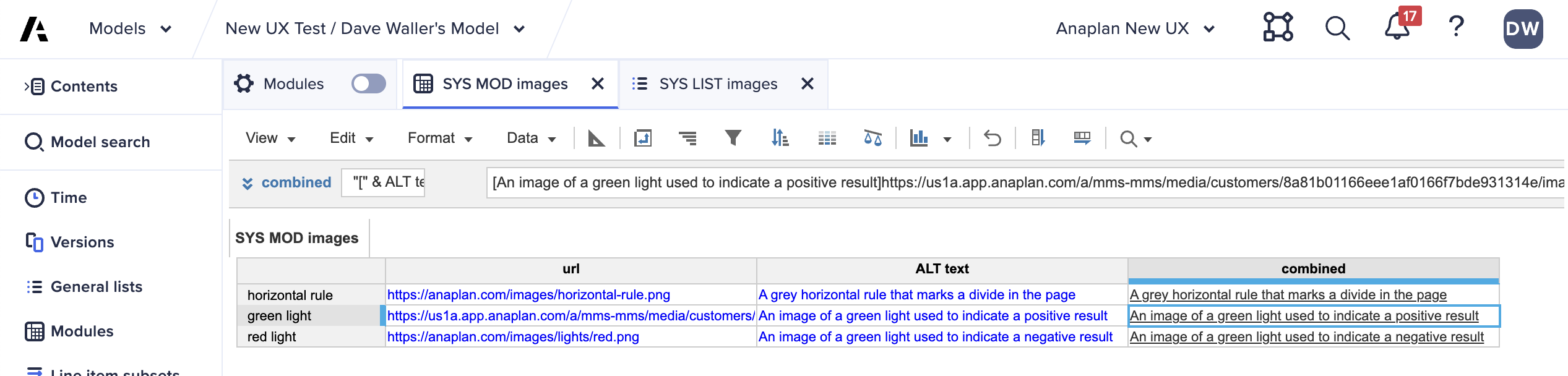
Being sure to use any agreed naming conventions, create a new list to hold the list of images you wish to store, and a new module dimensioned by your images list and two line items, one to hold a URL (formatted as text/link) and another to hold default ALT text (formatted as text/general).
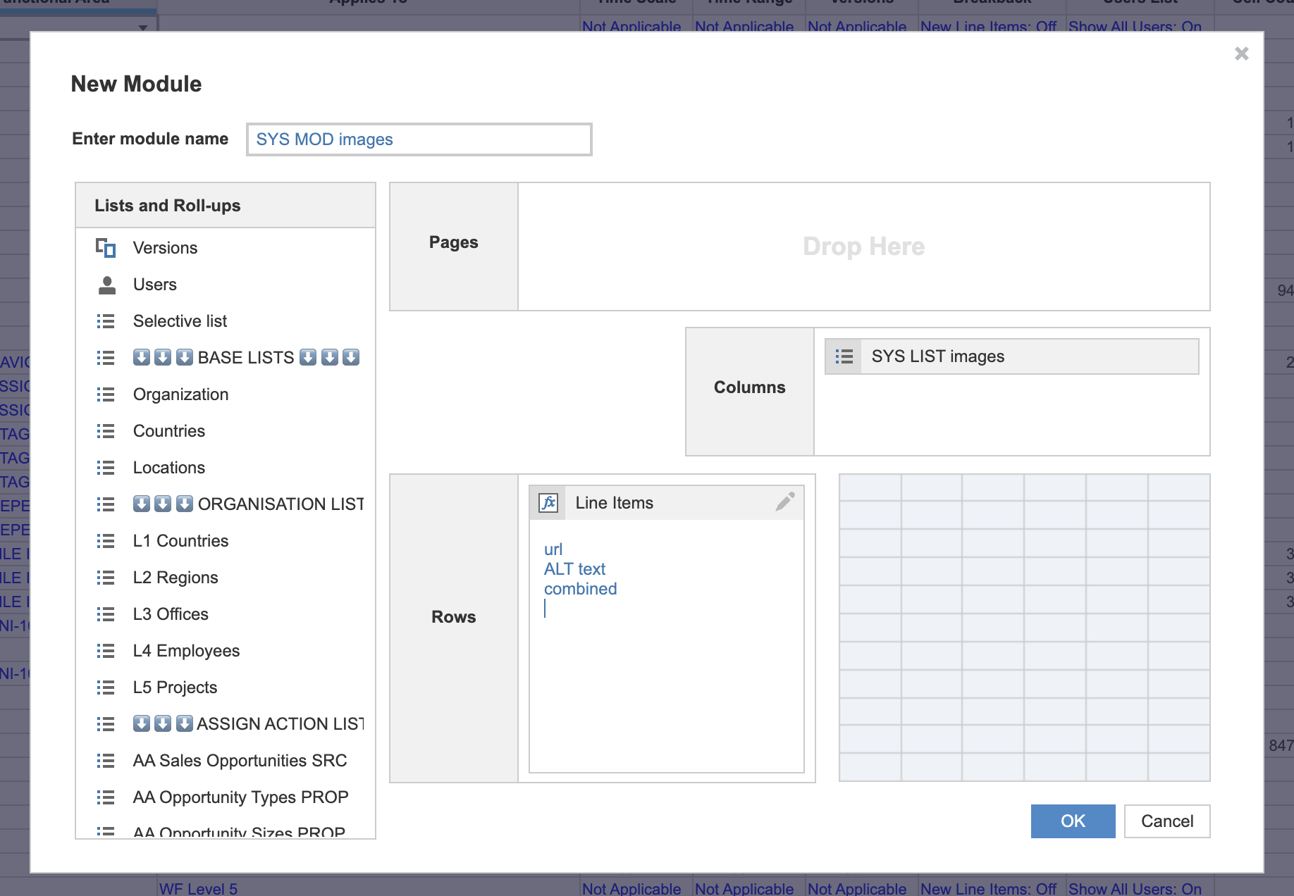
This module can be simplified, removing the capability for custom ALT text in the future, by giving it just a single text/link formatted line item told both URL and ALT text. Or, we can add a third line item to make things more sophisticated and store some baseline ALT text in our system module too. The following example shows all these options.
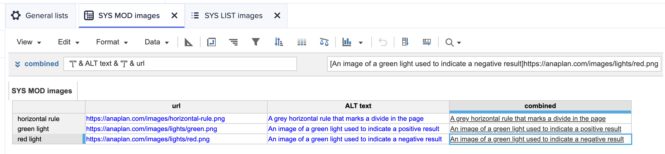
Once in place, the system module can be used to both embed images directly into UX pages or can be used as a base to refer to when adding images into other modules using formulas such as:
IF forecast value <= threshold THEN

  SYS MOD images.url[SELECT: SYS LIST images.red light]

ELSE

  SYS MOD images.url[SELECT: SYS LIST images.green light]
Using images from the asset library
Anaplan provides an internal asset store, offering centralized and secure storage for images used in Anaplan UX pages. The easiest way to use these images inside pages is to link them directly from the asset library, however this approach does not provide adequate ALT text when pages are published.
Instead, builders should expose the URL of the images in the asset library and use these to populate their system modules.
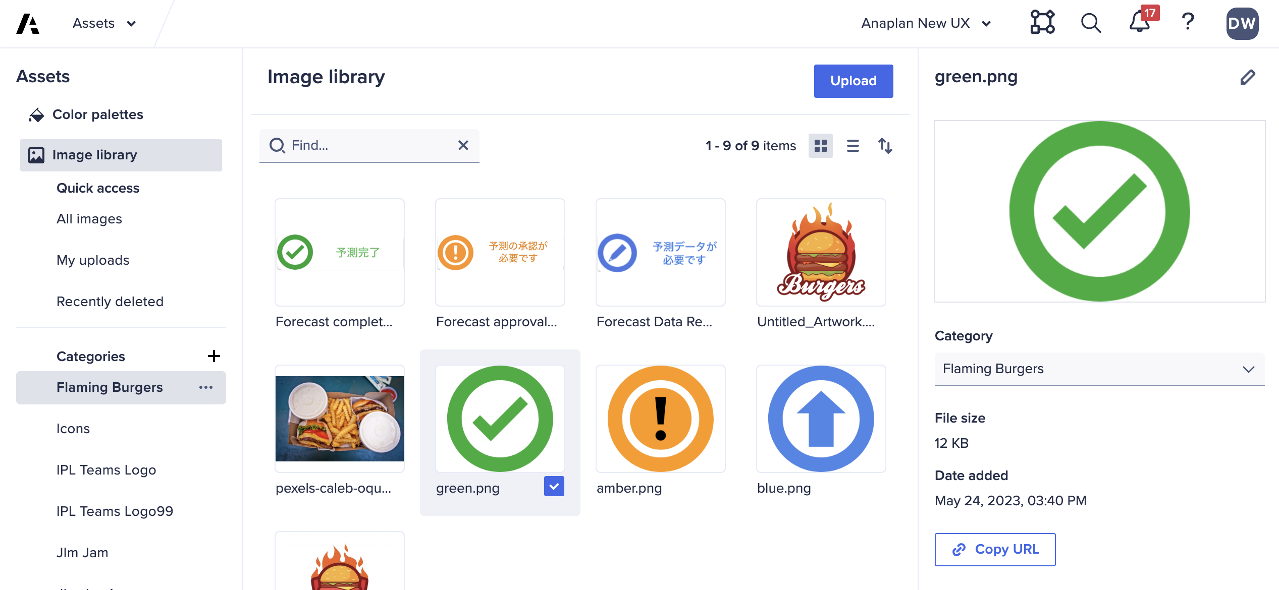
Once added to the asset library, images can be selected to expose a “Copy URL” button. This can be used to retrieve the URL for the uploaded image, ready to be added to the system module.
https://us1a.app.anaplan.com/a/mms-mms/media/customers/8a81b01166eee1af0166f7bde931314e/images/~

6ceb7ccf7c6549cf92fb36ec1208baac.png
Generating dynamic ALT text
Line items defined as text/link use a simple markdown format to define both display text and URL within a single data point.
[Display text]https://url.to.use/for-the-image.png
We can use simple concatenation formulas to build this value dynamically, crafting ALT text for the image that is aware of other model values and therefore more assistive to end users.
(Resource: Anapedia - Operators and constants)
If we want to display a red light image if a forecast value is less than the defined threshold, and a green light image if it’s higher, but also provide guidance on why the value is invalid, we can use a concatenating formula like:
IF forecast <= threshold THEN

  “[A red light image indicating that your forecast of “ &

  forecast & “ is invalid as it must be at least “ &

  threshold & “.]” & SYS MOD images.url[SELECT: SYS LIST

  images.red light]

ELSE

  “[A green light image indicating that your forecast of “ &

  forecast & “ is acceptable.]” & SYS MOD images.url[SELECT:

  SYS LIST images.green light]
This would, assuming the forecast ($900) is lower than the threshold ($1,000), generate a text/link formatted line item value of:
[A red light image indicating that your forecast of 900 is
invalid as it must be at least 1000.]https://.../red-light.png
This approach can also be extracted out a little by using an additional line item, here in the forecast module, to define our ALT text but only if we need it. If no custom ALT text is provided then we can fall back to that defined in the system module:
IF Forecast.forecast <= Forecast.threshold THEN

  IF ISBLANK(Forecast.ALT text) THEN

    SYS MOD images.combined[SELECT: SYS LIST images.red light

  ELSE

    “[“ & Forecast.ALT text & “]” & SYS MOD images.url

    [SELECT: SYS LIST images.red light

ELSE

  ...
This simple addition checks to see if a custom ALT text value exists in the forecast module. If it does, it gets combined with the image URL to create a custom text/link line item value. If it’s blank, then we fall back to the “combined” value defined in the system module.
In complex cases, care should be taken to try to minimize the number of cells used when concatenating values into a single text string. The use of “&” can introduce slowness to some calculations if multiple cells, modules and line items are used to generate a single value.
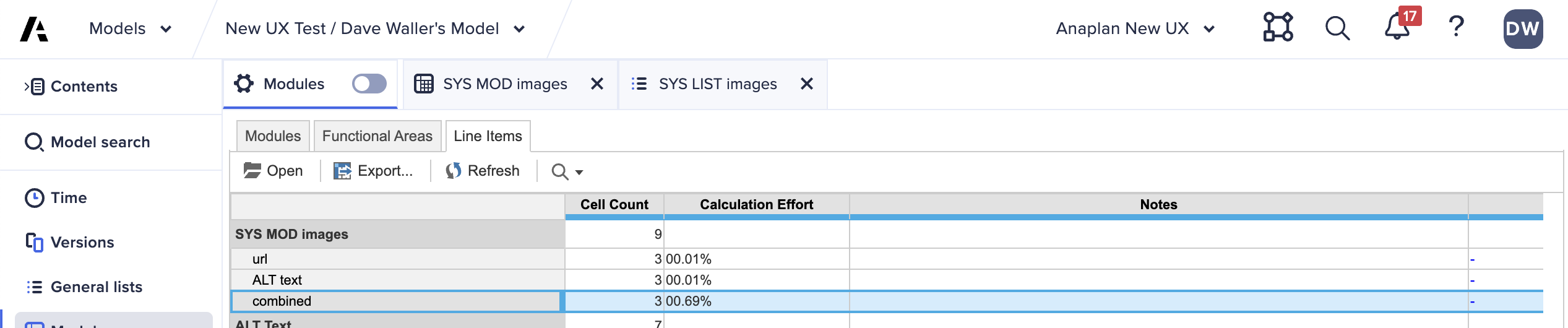
You can view an indication of the calculation complexity of a concatenated line item using the “modules” > “line items” view and the “calculation effort” value for your line items.
Adding images to UX pages
Line item driven image URLs can be added to UX pages with the use of image cards. When adding an image card, be sure to select “line item” as the image source.
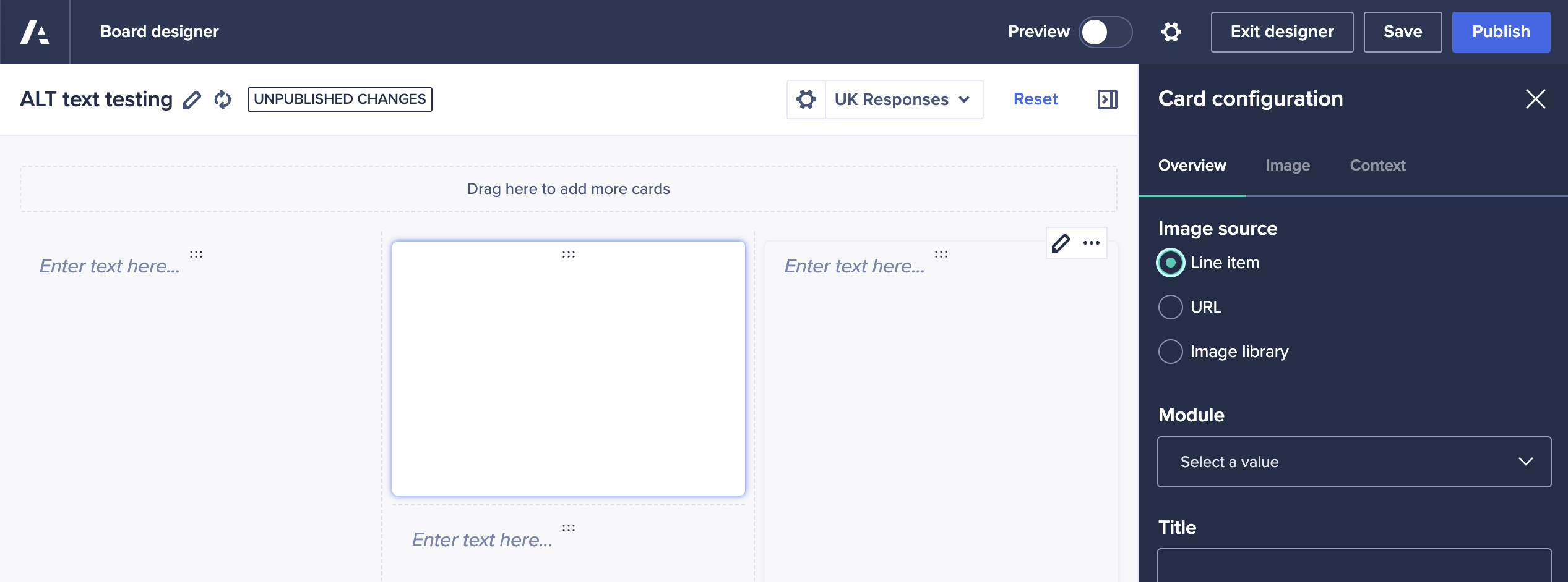
Select the module and the line item to use to define the image — this can be your system module if your images are static, such as logos or horizontal rules.
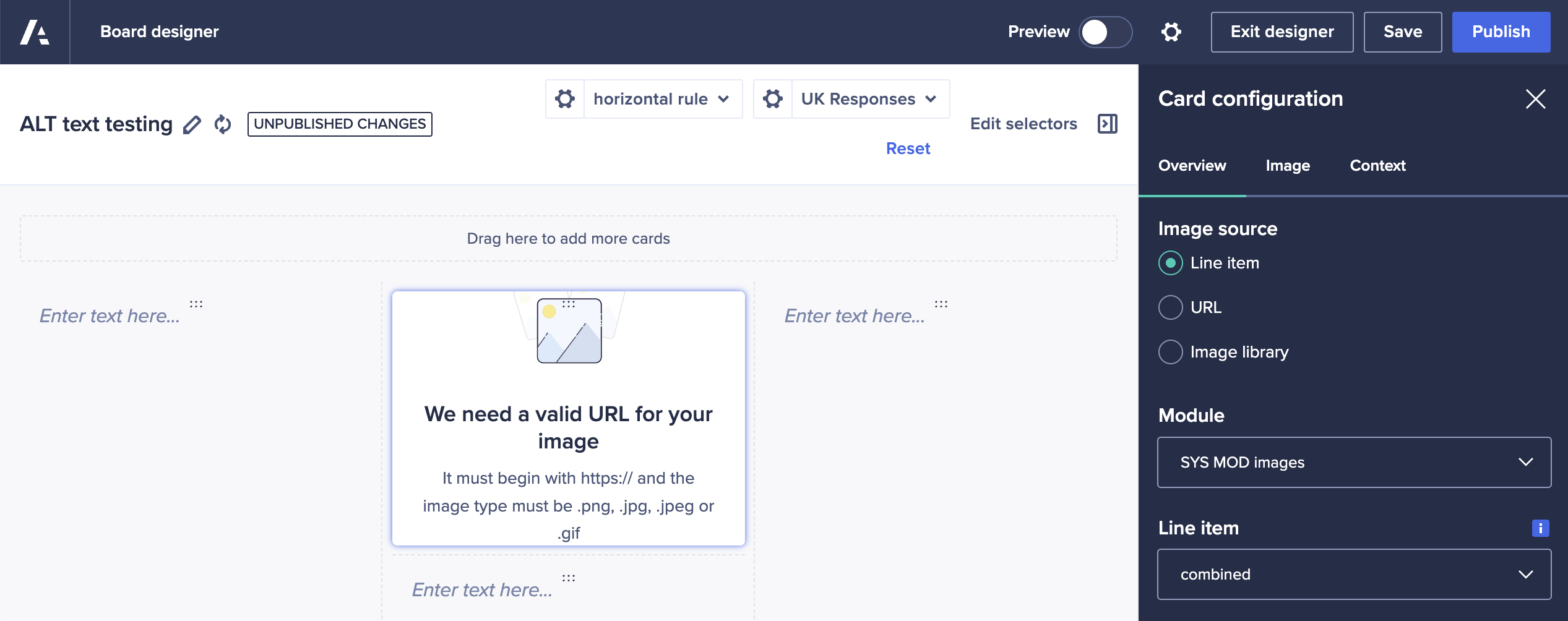
Depending on how your system list is defined, you may initially get an error message that your image is not valid. This is because we are yet to specify which image we want to reference. We do this using the “context” tab in the right-hand panel.
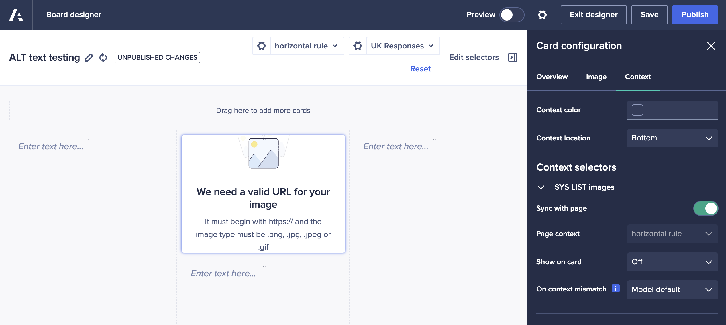
By opening the section for “SYS LIST images” we need to make a few changes:
- We need to disable “sync with page” to ensure that the page builder defines the image
- We need to select the correct image for the “page context” value
- We need to make sure that “show on card” is set to “off” to ensure that end users can’t change the image that’s displayed
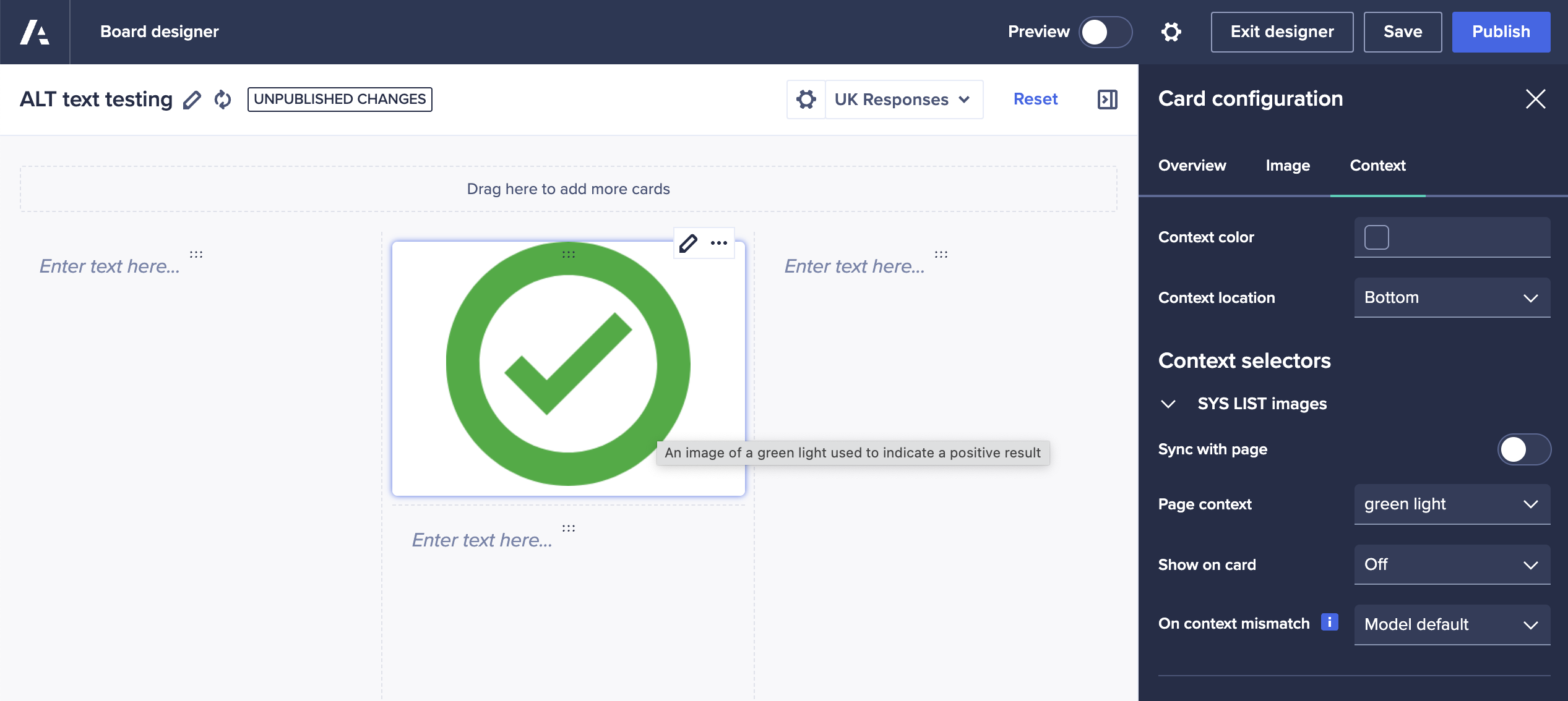
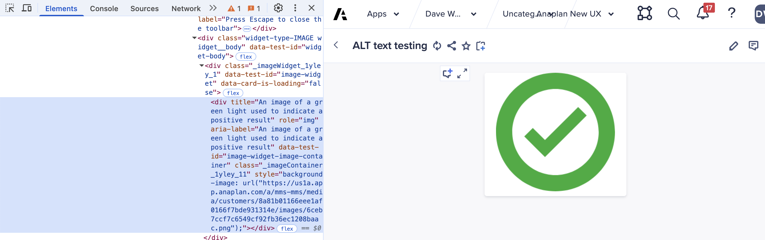
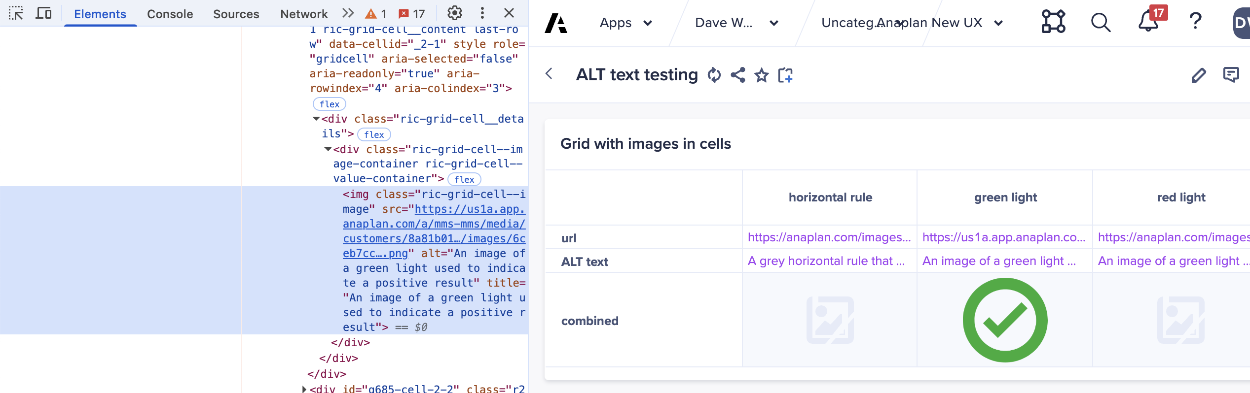
These changes will display the line item driven image inside the image card and will implement the correct ALT text for the image in both the builder and published modes.
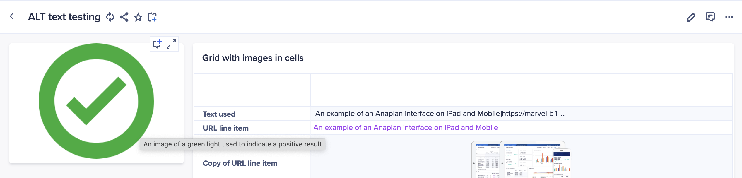
Adding images to UX grids
When adding grids of data to a UX page, they will display all text/link formatted line items as text values by default.
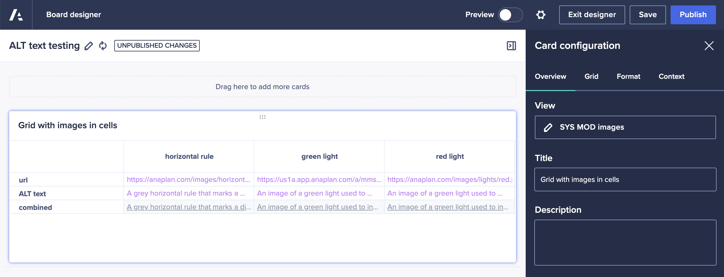
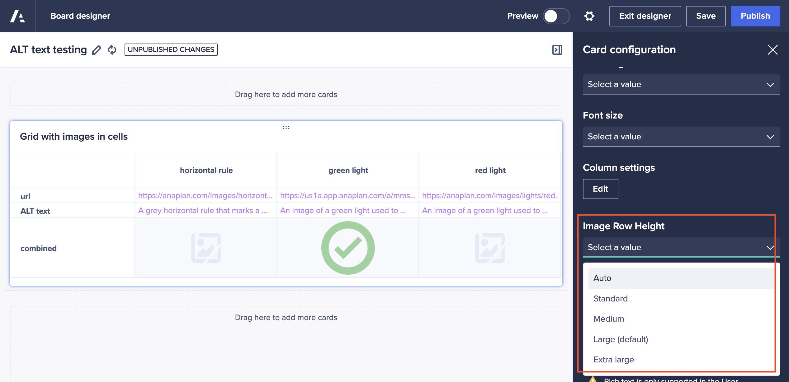
Using the “line item image settings” section at the bottom of the right-hand panel you can decide which line items should render as images rather than text. Using our system module, the only line item defined as text/link is the “combined” line item that defines both the url and ALT text.
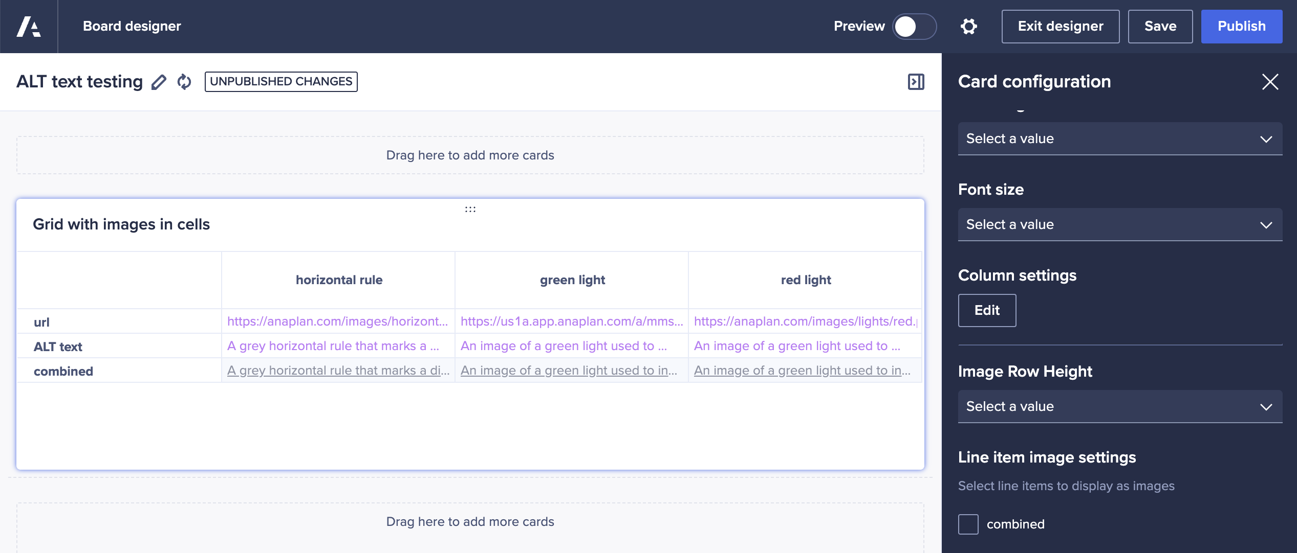
Enabling this line item to display as an image has an immediate effect on the preview of the grid, now showing an image in the cell rather than text.

Once enabled as image display, we can also tailor the size of the image if needed.
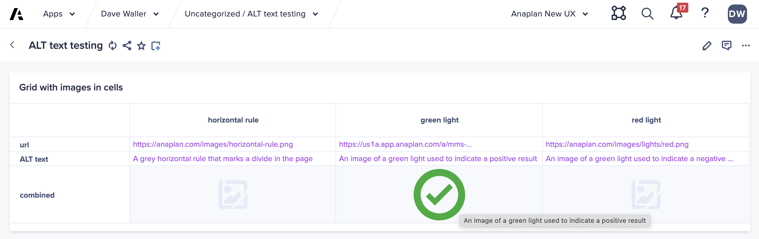
The published page now includes the grid images, at the specified size, along with appropriate ALT text.
Questions? Leave a comment!
……………
Also by Dave: End user triggering of workflow processes.